
The brief
Vang launched as a new product line under LaserPerformance, the sailing brand I worked with for several years. A new product line meant starting from close to zero: no existing logo, no packaging, no way for a retailer or sailor to recognise it on a shelf or a website. The brief covered the full go-to-market kit (logo, product display, brochure, and landing page), which meant every decision had to hold up across very different formats: a small mark on a physical box, a full-bleed hero image on a webpage, and dense spec copy in a printed brochure.
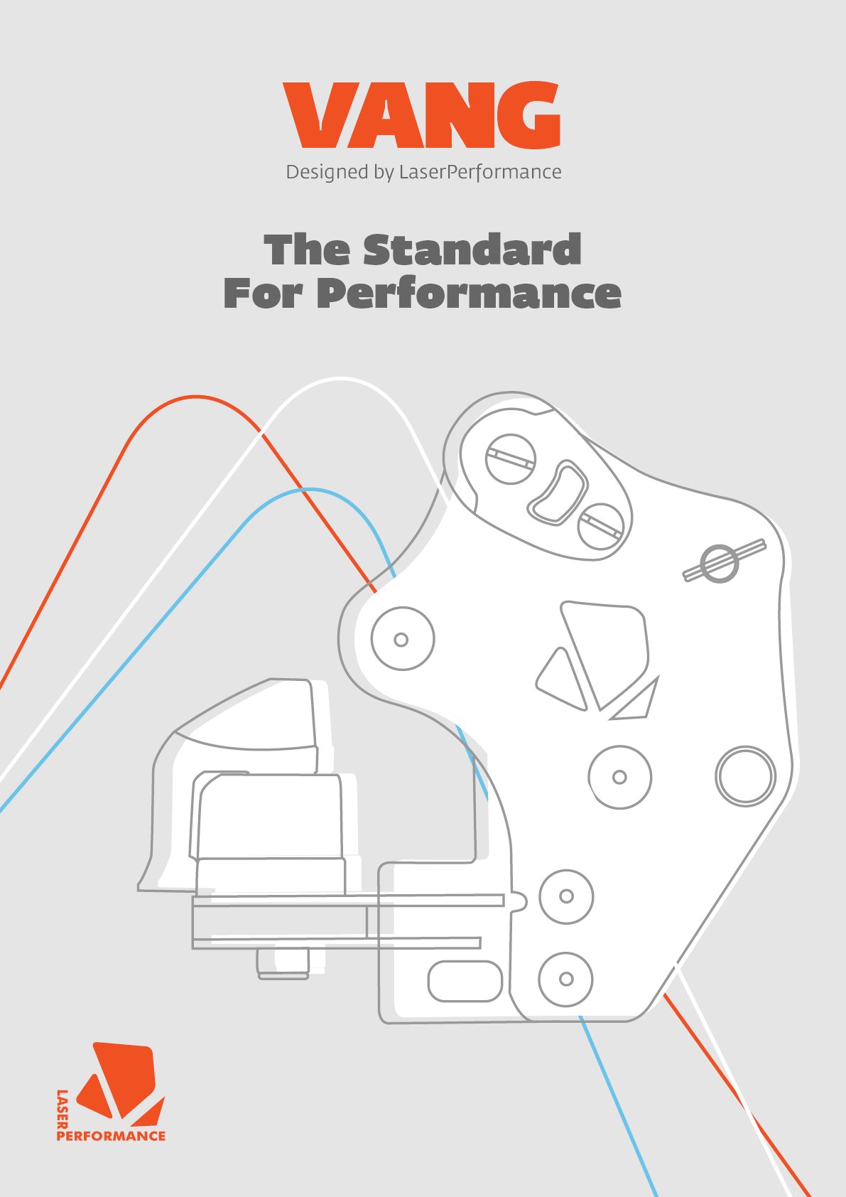
The logo built to read at a glance, in one colour, before anything else has to work.
Designing for the shelf first
Packaging is judged in about two seconds, standing next to competitors on a real shelf or a crowded search results page, so the logo had to read at a glance, in one colour, at a few centimetres tall, before it ever had to do anything clever. I kept the mark simple and high-contrast on purpose, then let the more expressive parts of the identity (colour, product photography, layout) carry the personality in the spaces where there was room to breathe, like the landing page and brochure spreads.
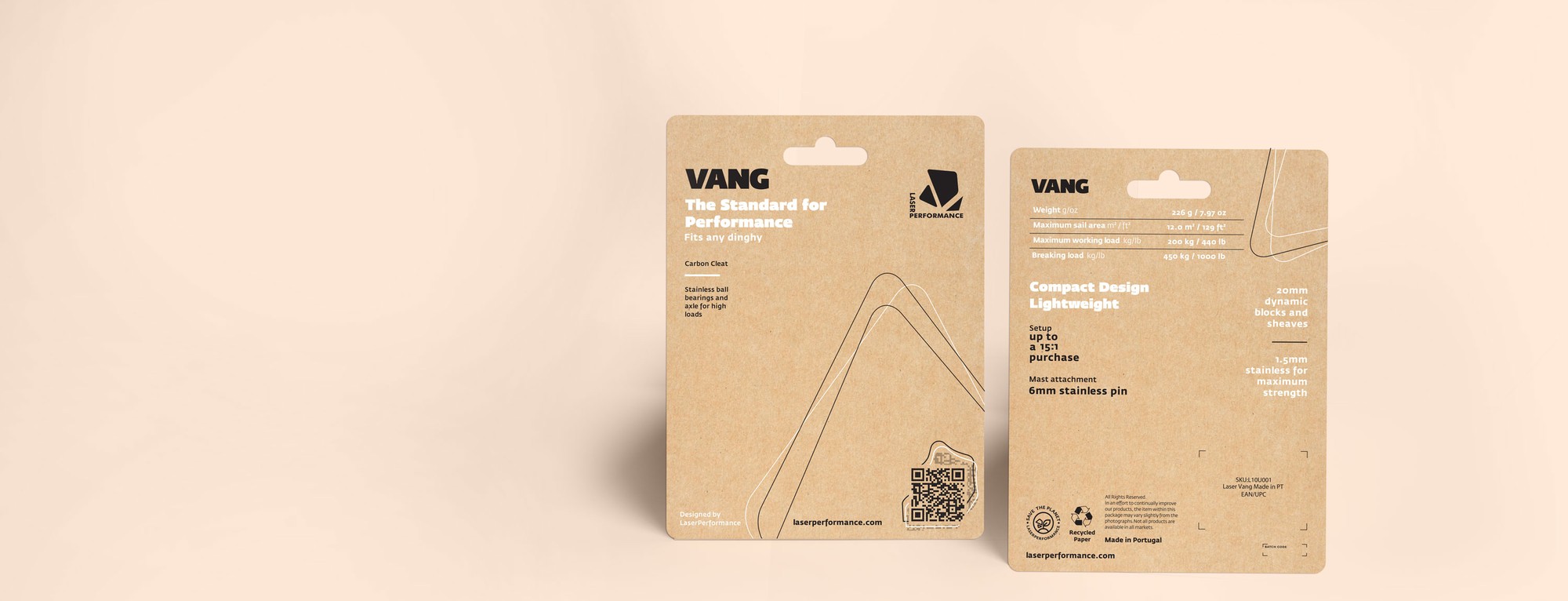
Front and back of the physical blister pack: the format the logo actually had to survive at shelf size.
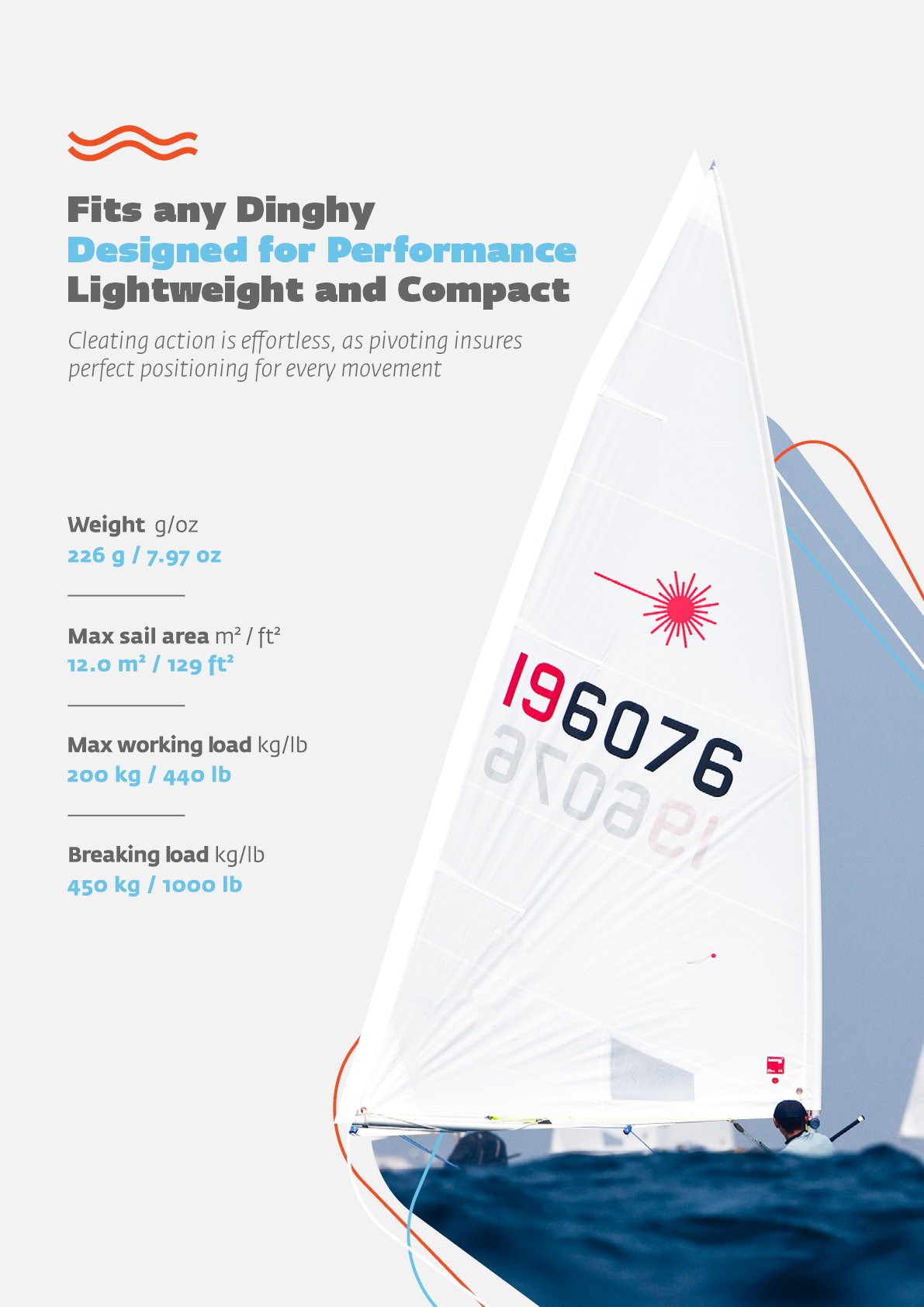
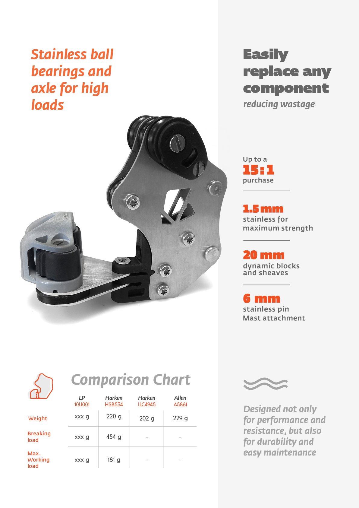
Product photography and spec sheets built to hold their own next to competitor comparison charts.
Consistency across four different jobs
Logo, packaging, brochure, and landing page each have a different job: recognition, protection, persuasion, and conversion, respectively. The system was built so the same colour palette and type choices carry through all four without the mark itself needing to change size relationships or spacing rules from one to the next, a small thing, but it's what stops a brand from looking like four separate decisions made in isolation.
Brochure back cover, carrying the QR code and certification marks through to the very last page.