
The brief
Cascais is a sailboat model under the LaserPerformance range, named after the Portuguese sailing town. Unlike a standalone consumer brand, it had to sit inside an existing family of boats (recognisably part of the same manufacturer), while still standing on its own with a name, a story, and a visual identity a sailor could feel proud to have on their hull. My role covered the visual identity, graphic elements, brochure, and the launch teaser; Carolina Santos handled the 3D renders; the LaserPerformance team supplied the sailboat drawing and product photography.
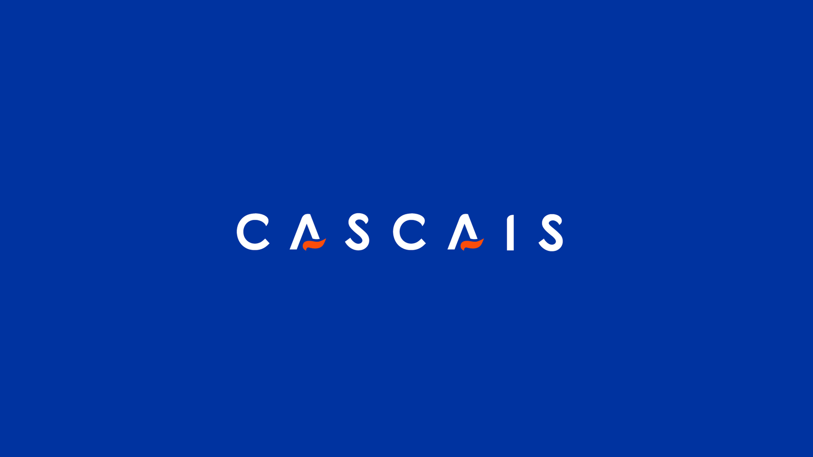
The wordmark on the brand's core blue, a small orange wave squiggle marking each letter A.

The mark broken down into standalone variations, for spots too small for the full wordmark.
Borrowing the town's own character
Rather than invent a mood from nothing, I leant on what Cascais the place actually is (a coastal, understated, slightly upmarket Portuguese sailing town) and let that inform the palette and type choices, instead of defaulting to generic "nautical" clichés (rope textures, anchor icons) that show up on every sailing brand. The goal was an identity that felt specific to this boat, not interchangeable with any other name that could have been printed on the same hull.
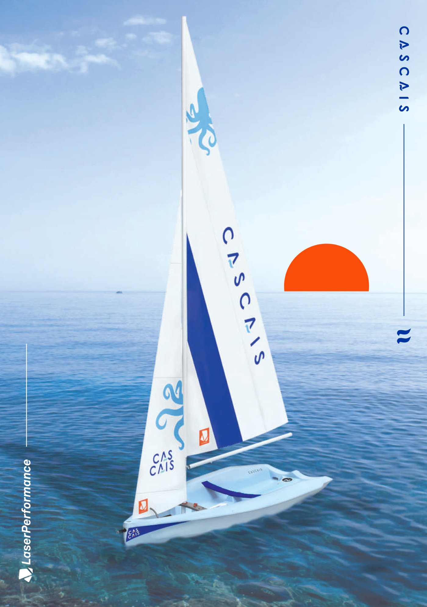
Brochure cover, built around a real sunset sail rather than a studio render.
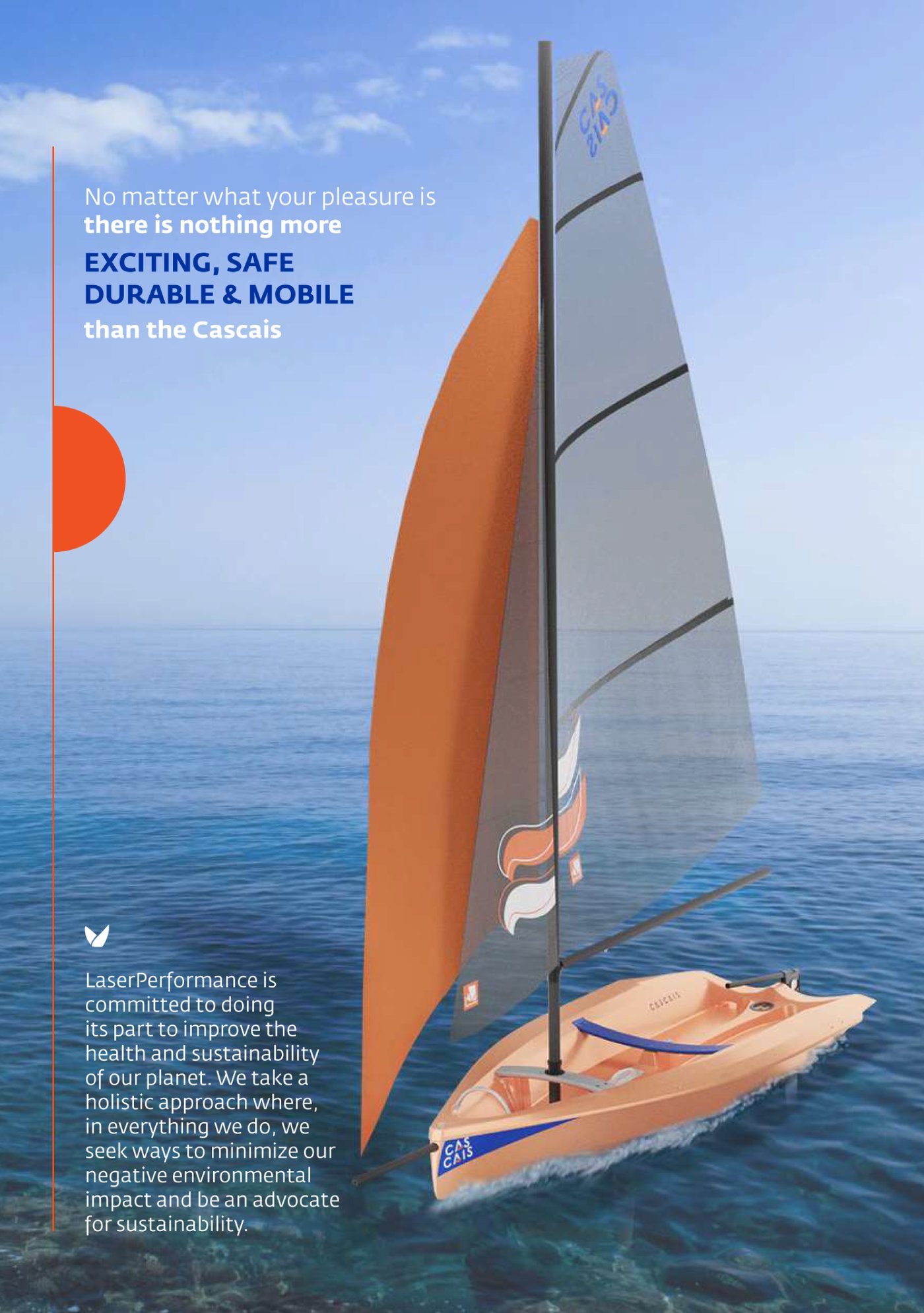
Copy and imagery built around the same coastal, unpretentious character, not stock "nautical" tropes.
Designing across a team, not alone
With 3D renders coming from Carolina and the boat drawing coming from the LaserPerformance team, the visual identity had to work as a shared language everyone could design into, brochure layouts had to leave the right space for renders that weren't mine to control, and graphic elements had to look intentional whether they sat next to a photograph, a 3D render, or plain product spec copy.
The brochure, and the boat out sailing
The rest of the brochure carried the same system across hull colourways, feature call-outs, and accessories, laid out to leave room for the 3D renders and product photography coming from Carolina and LaserPerformance.
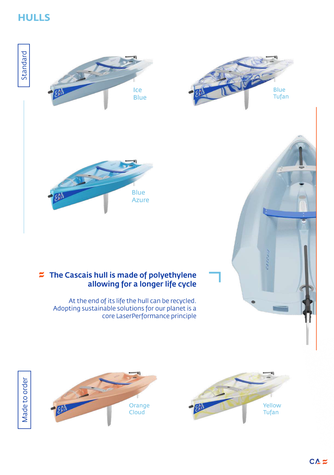
Hull colourway options, standard and made-to-order.
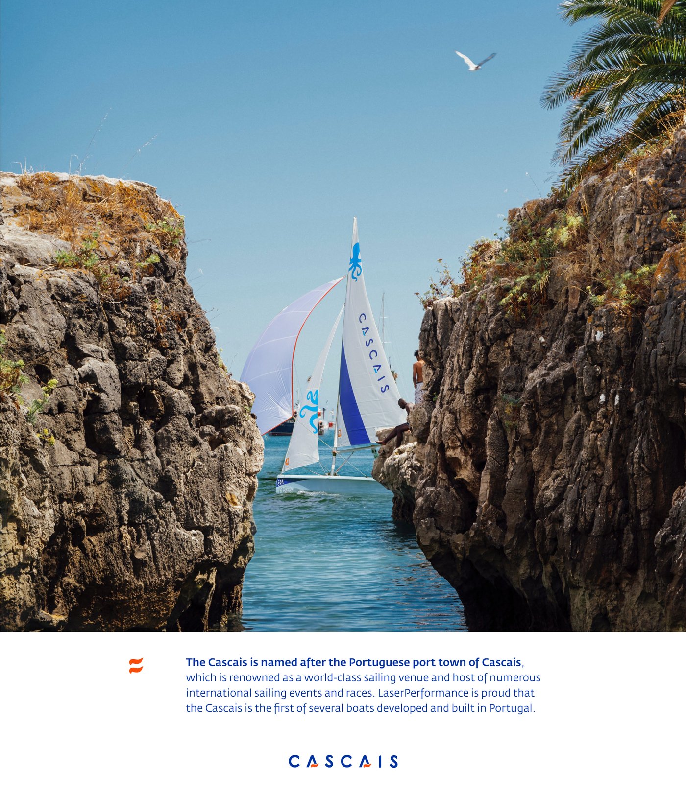
The naming story, given its own page rather than a footnote.
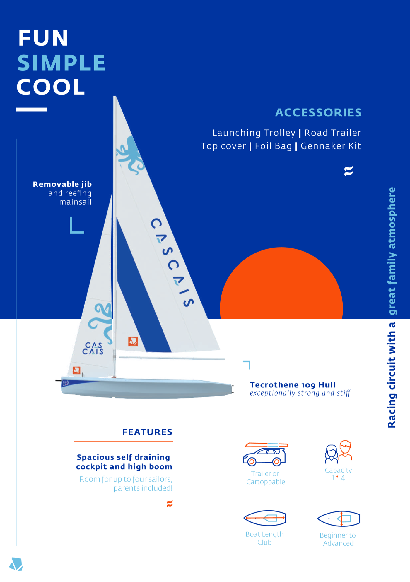
Feature and accessories spread.
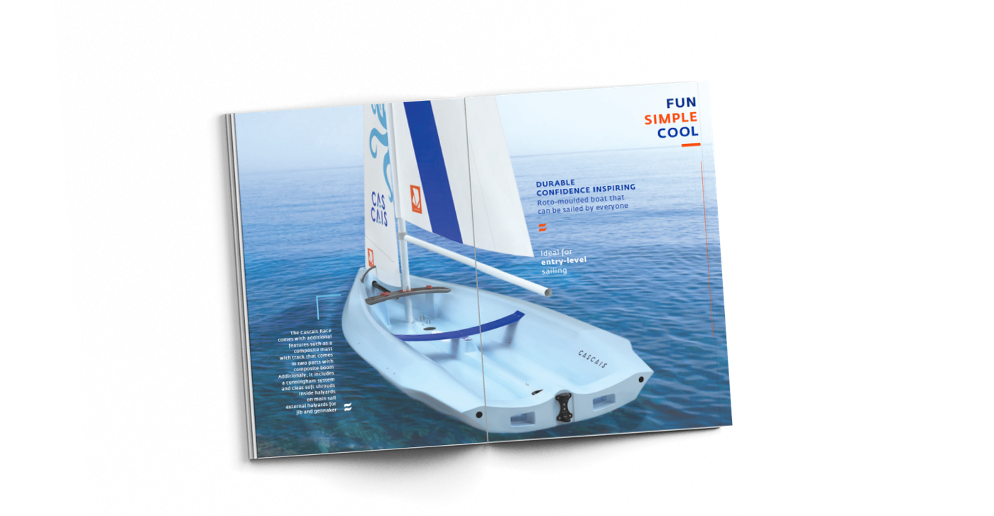
Spread mockup, keeping the tone light: fun, simple, cool.
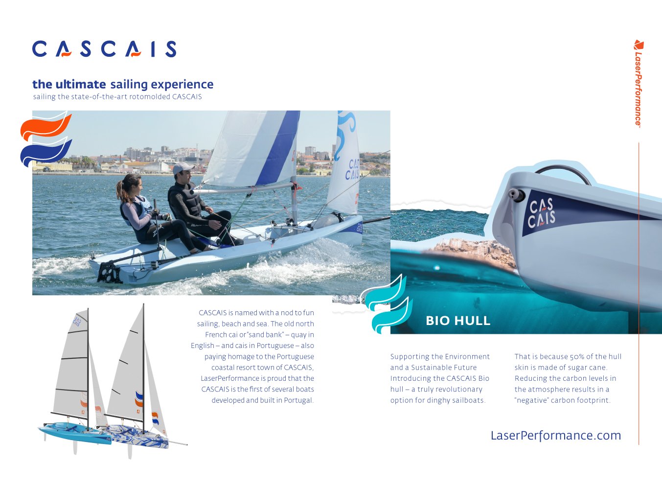
Closing spread, introducing the sugar-cane-based Bio Hull option.
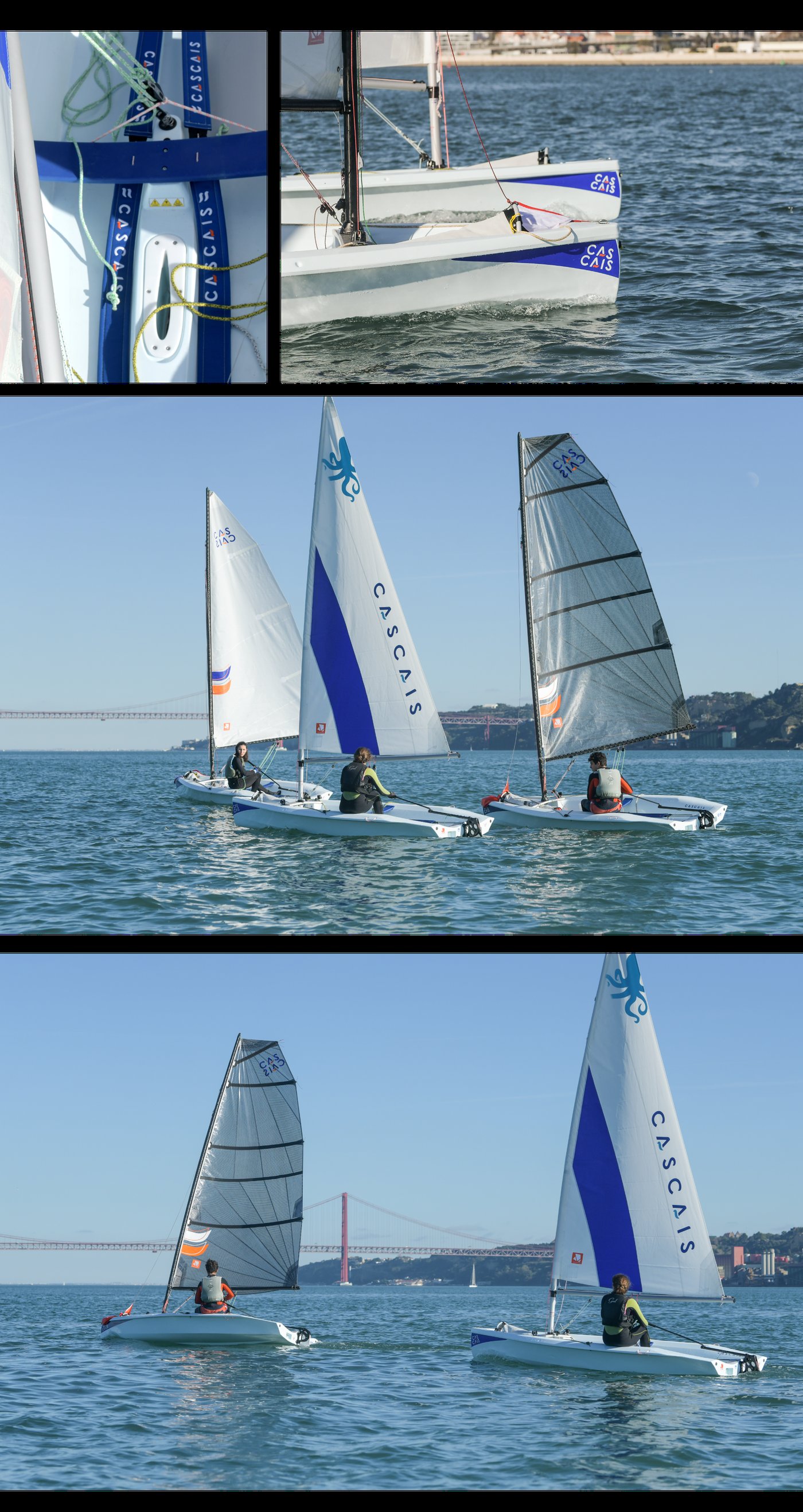
The finished identity out on the water: sail graphics as they actually look under load, not just on a spec sheet.
The launch teaser
I directed and cut a short teaser to announce the boat, built from stock footage and reusing the same wordmark treatment for the reveal.
Launch teaser.