
The brief
Sunfish is a long-running sailboat model, and its existing logo carried the visual language of an earlier era in the sport. The brief was a restyle, not a reinvention: bring the mark in line with how the brand looks today, while keeping it recognisable to sailors who already know the boat.


Before and after: the original mark, next to the restyled icon-and-wordmark lockup, friendlier proportions on the fish, an italic lean on the wordmark.
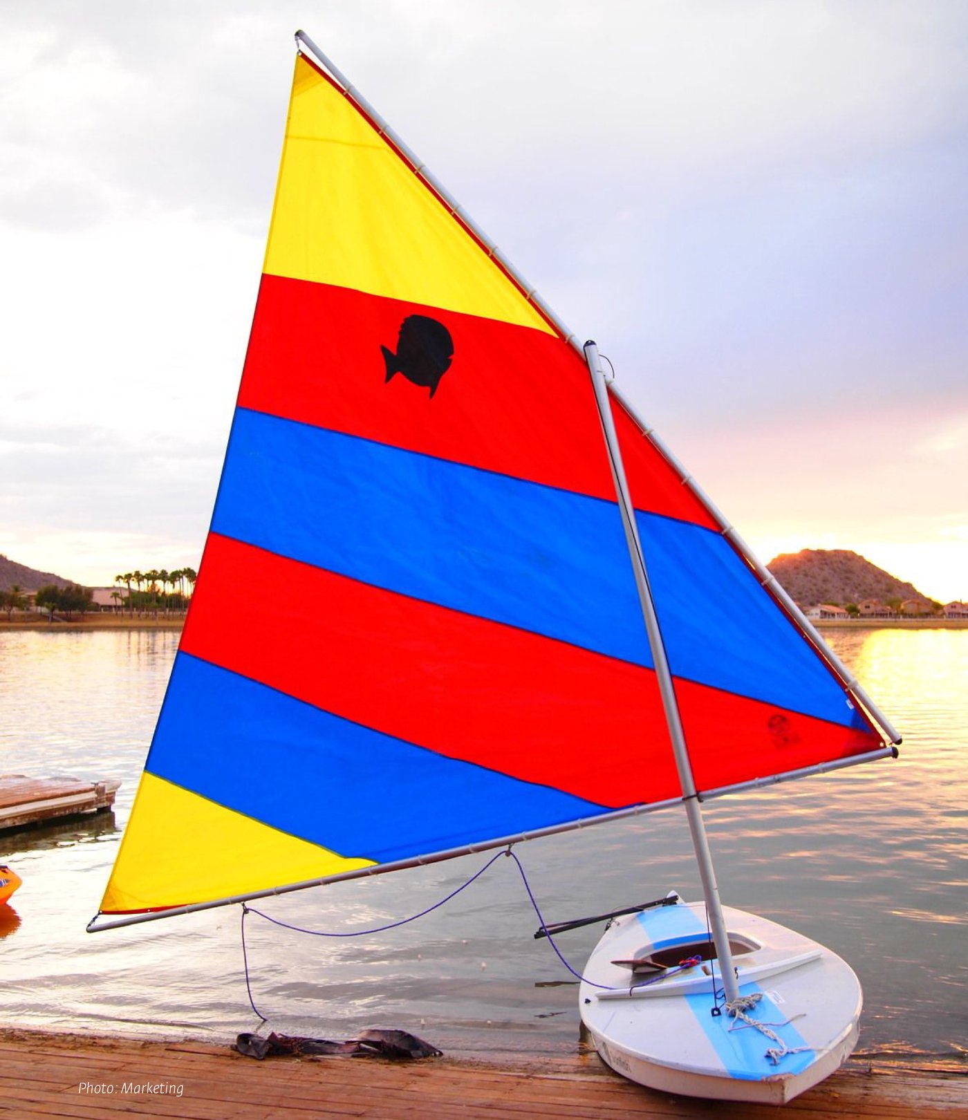
How the original mark actually shipped: a plain fish silhouette printed straight onto the sail.
Restyling without losing recognition
A restyle is a different problem than a new identity: the constraint isn't "what could this be," it's "what can this become without breaking what people already recognise." The new mark leans friendlier and more playful, aimed at bringing in a younger generation of sailors, while keeping enough of the original's structure that long-time Sunfish owners would still know it at a glance.

The mark in a second colourway, kept simple enough to still read at a glance on a sail or a hangtag.
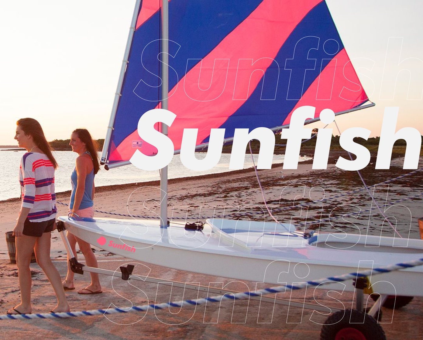
The restyled wordmark carried into lifestyle photography and on-boat branding.
A pictogram system for reading a spec sheet at a glance
Alongside the mark, I designed a small icon system to carry each boat's specifications (trailer compatibility, capacity, sail area, draft, length, beam) as simple line pictograms instead of a table of numbers. It's built to be read in a couple of seconds, on a product page or a printed spec sheet alike, and it's the same set of icons that now runs across the brand's communications for the full boat lineup, not just this one model.
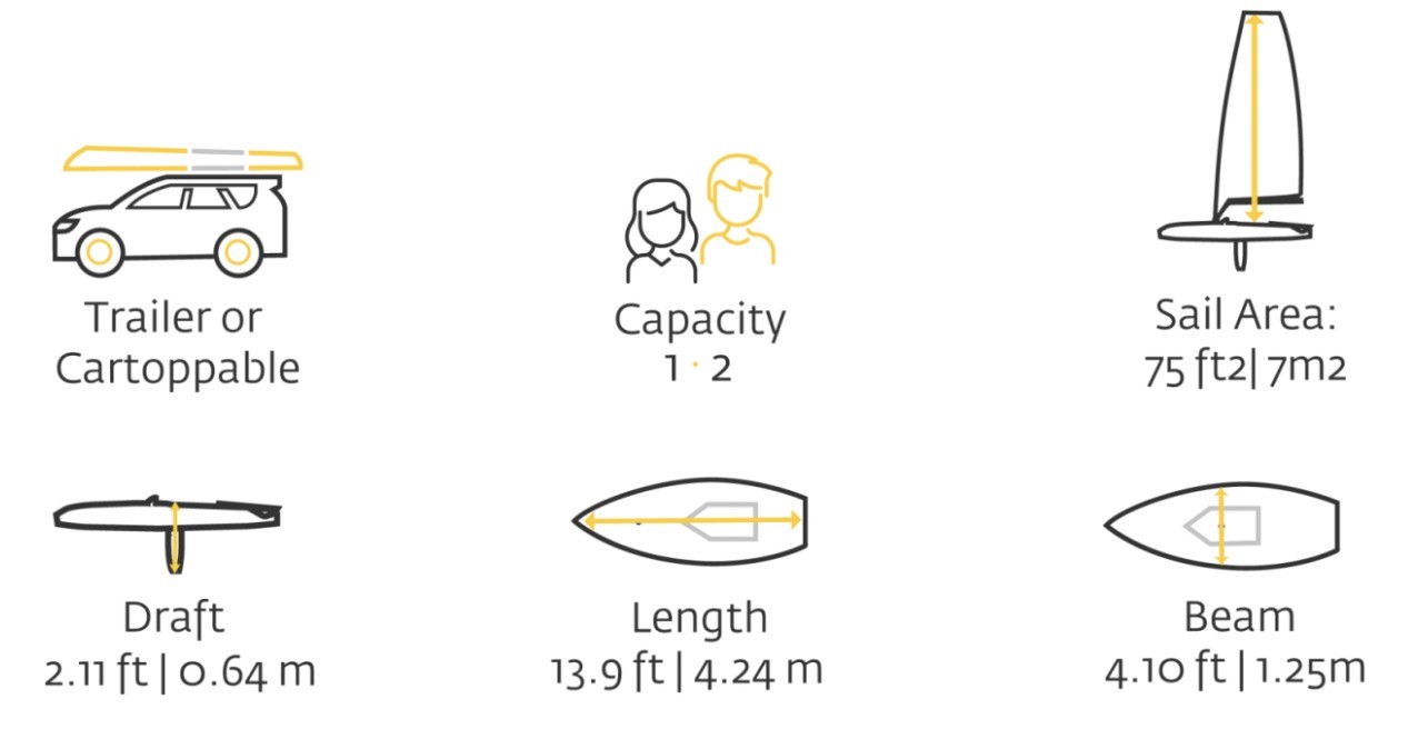
The spec icon system, shown here with Sunfish's own numbers: the same set is reused with each boat's own measurements swapped in.