
The brief
Art direction across several client accounts running at the same time, each with its own tone, audience, and posting cadence. The real skill this kind of work tests isn't any single post; it's holding several distinct brand voices in your head at once without letting one bleed into another.
Surfgasm
A casual, high-energy surf brand: event posters and campaign graphics built around bold color-blocking and collaged photography.
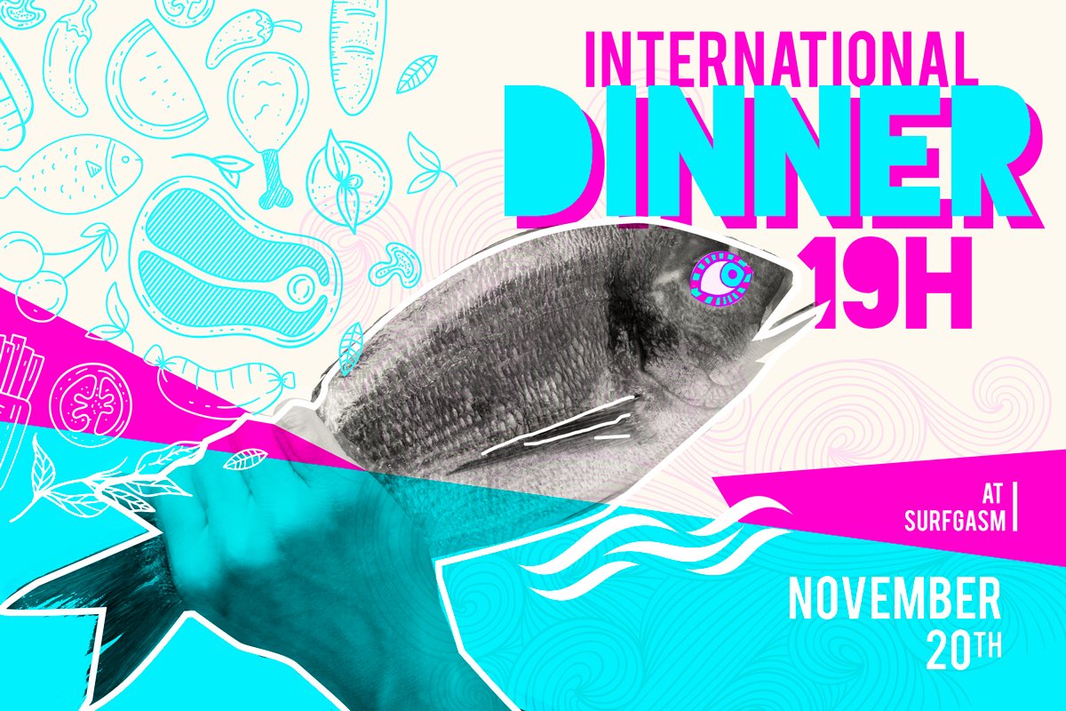
Surfgasm: "International Dinner" event poster.
Surfgasm, Estagiários Online & Montesco: same week, three tones
Three accounts posting in the same week, side by side: Surfgasm's Christmas Night poster next to smaller-format tiles for Estagiários Online and Montesco, each with its own distinct visual language, run back to back without one bleeding into another.
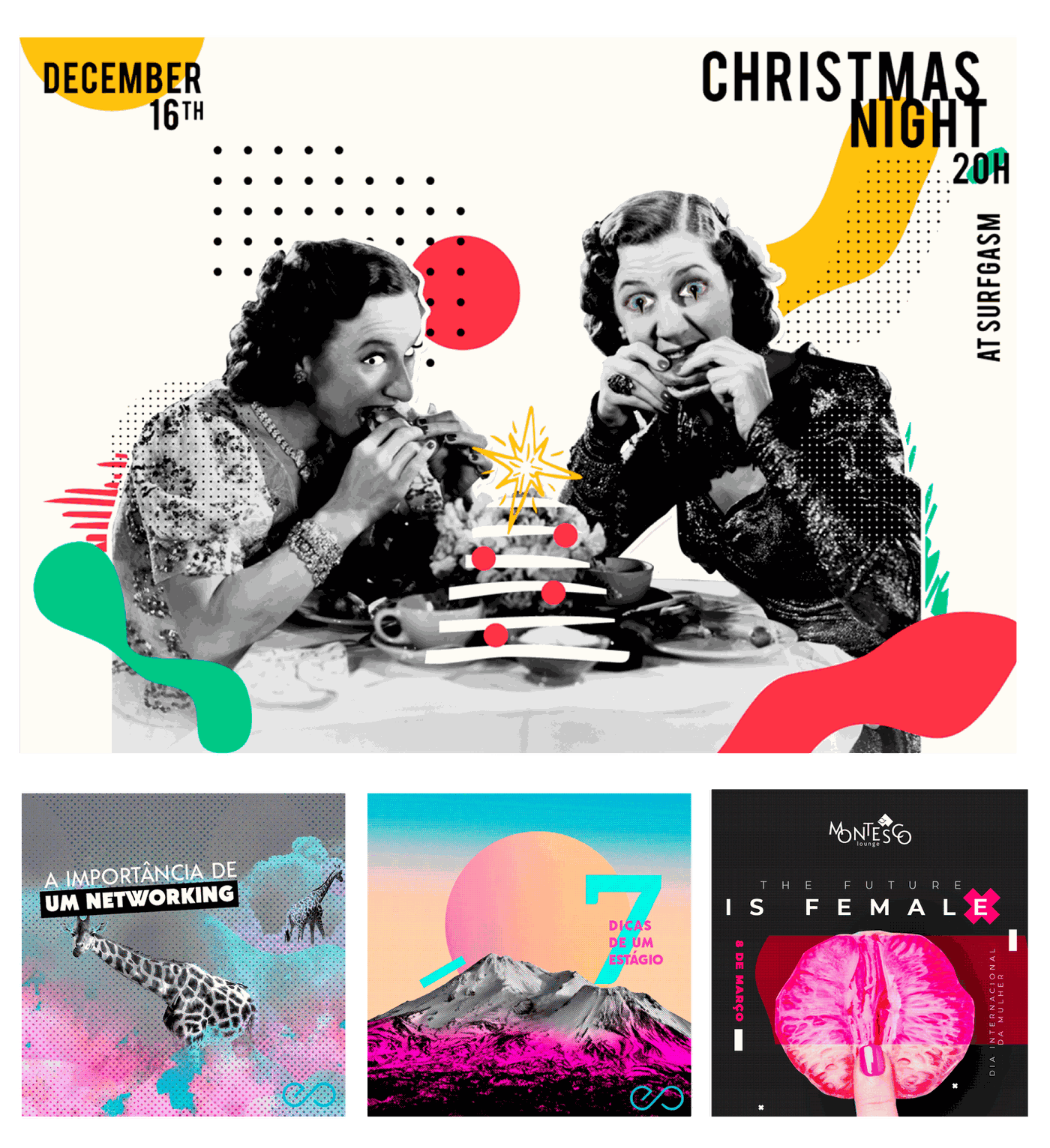
Surfgasm, Estagiários Online & Montesco: one week's posts, side by side.
Maclaren
The baby-stroller brand's grid: soft, photography-led, and paced for a family audience rather than a nightlife one, the opposite end of the tone spectrum from Surfgasm.
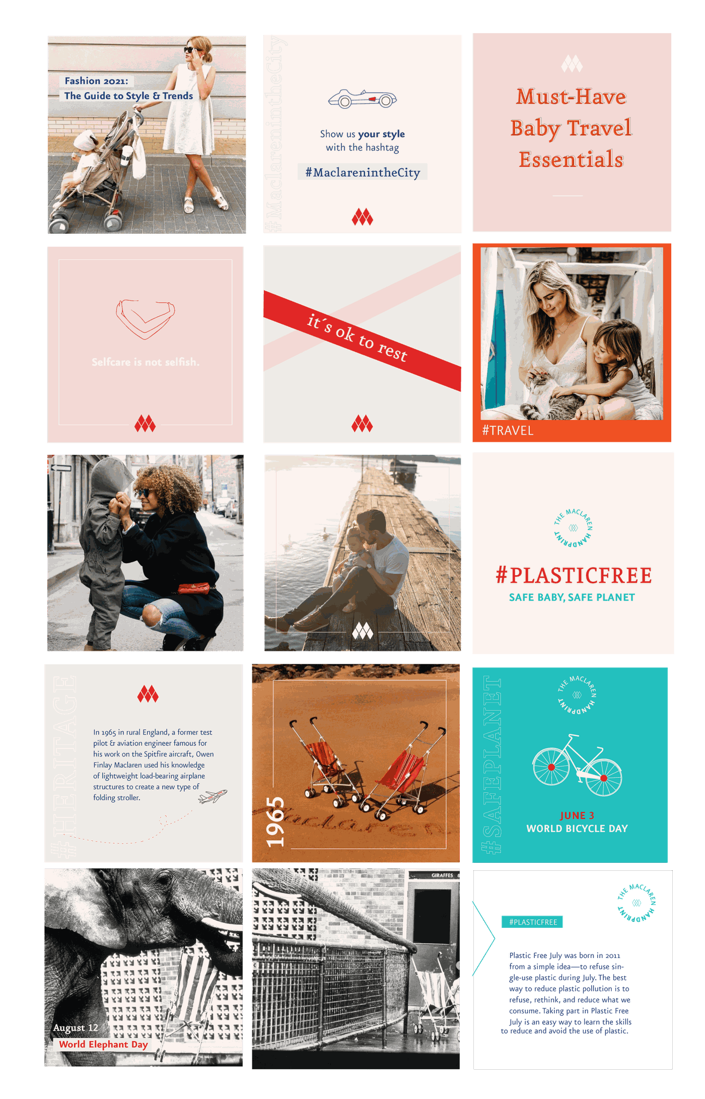
Maclaren: Instagram grid, mixing lifestyle photography with brand-heritage graphics.
Switching brand voice on demand
Surfgasm's content leans casual and high-energy; Maclaren's baby-product content needs to feel careful and trustworthy in a way that a surf brand never has to. Working across both in the same week meant building a genuinely separate visual toolkit for each account (different type pairings, different photo treatment, different pacing) rather than one flexible template stretched to cover everything, which tends to flatten every brand into the same voice.
Earlier agency work
A handful of pieces from the same period, done for smaller accounts and one-off campaigns rather than an ongoing content calendar.
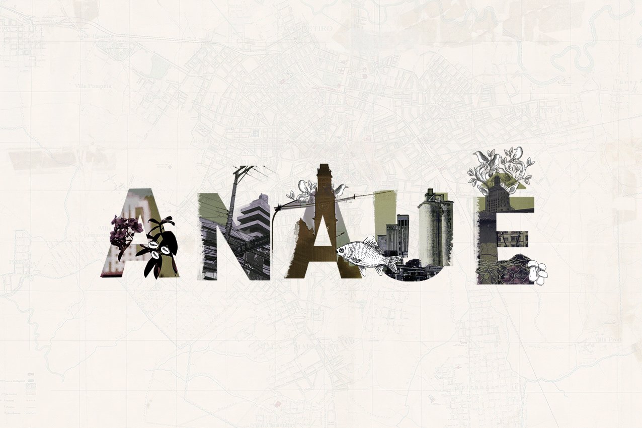
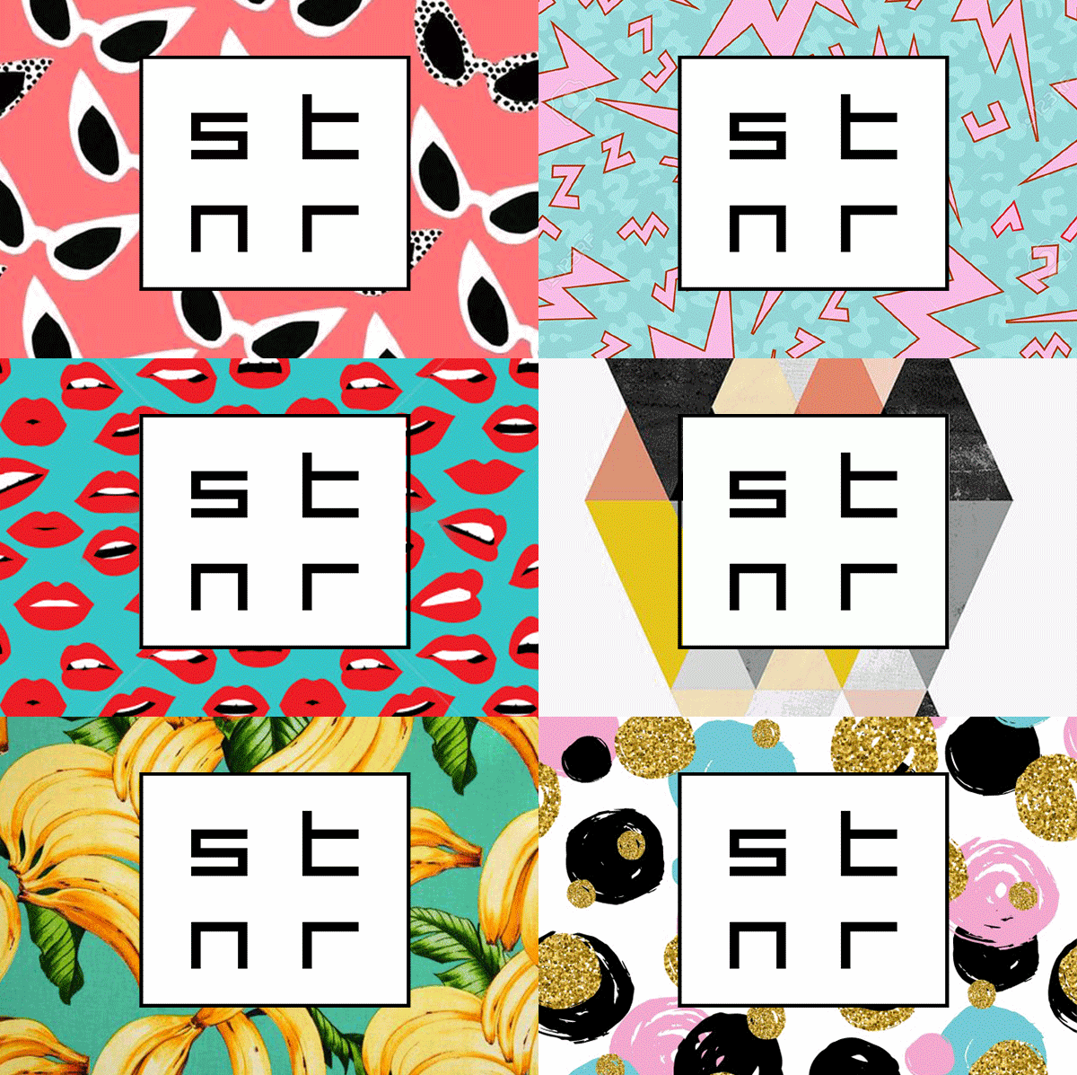
ANAUÊ: custom lettering built from city-map textures. STNR: a repeating cat-eye-sunglasses pattern for the logo mark.
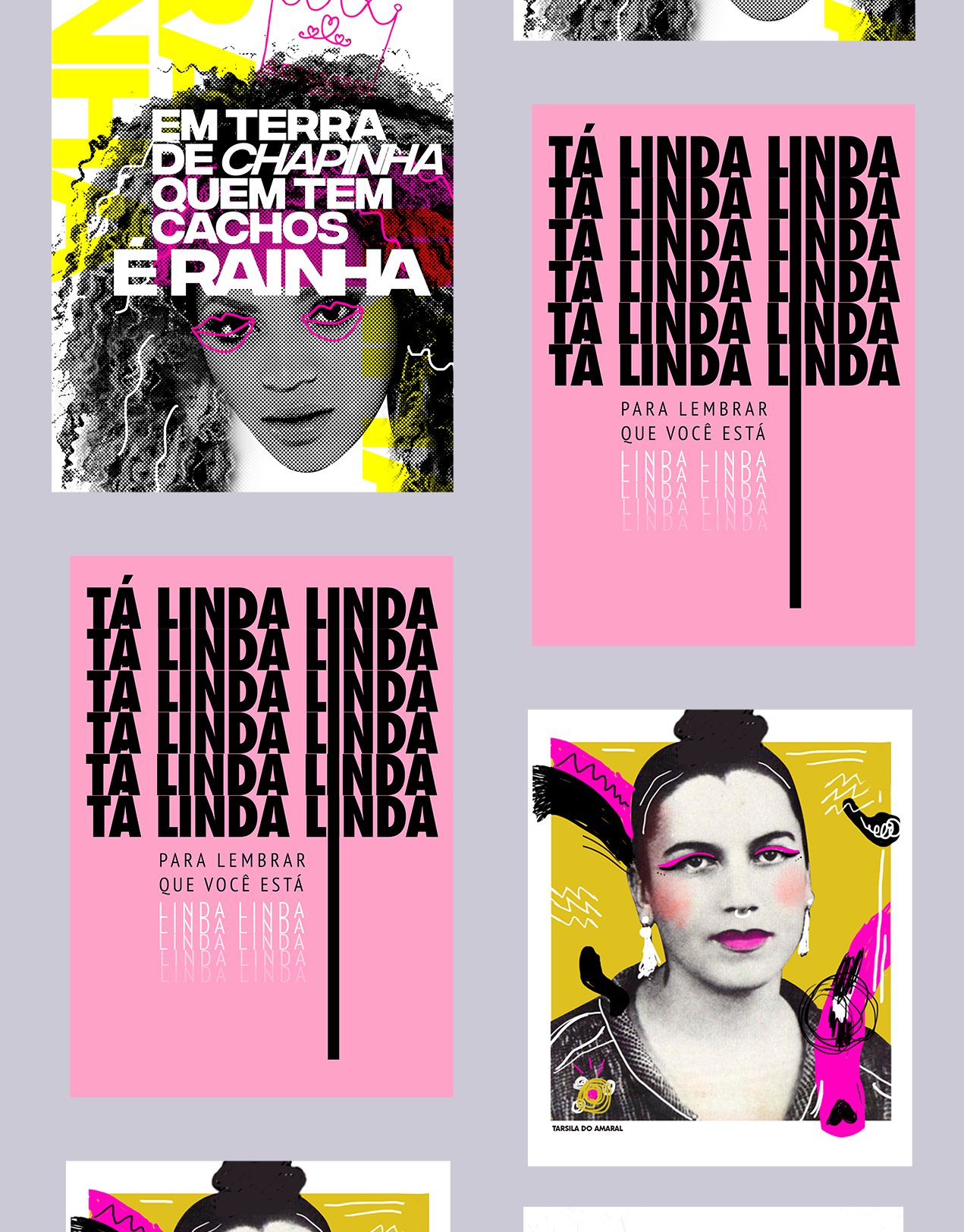
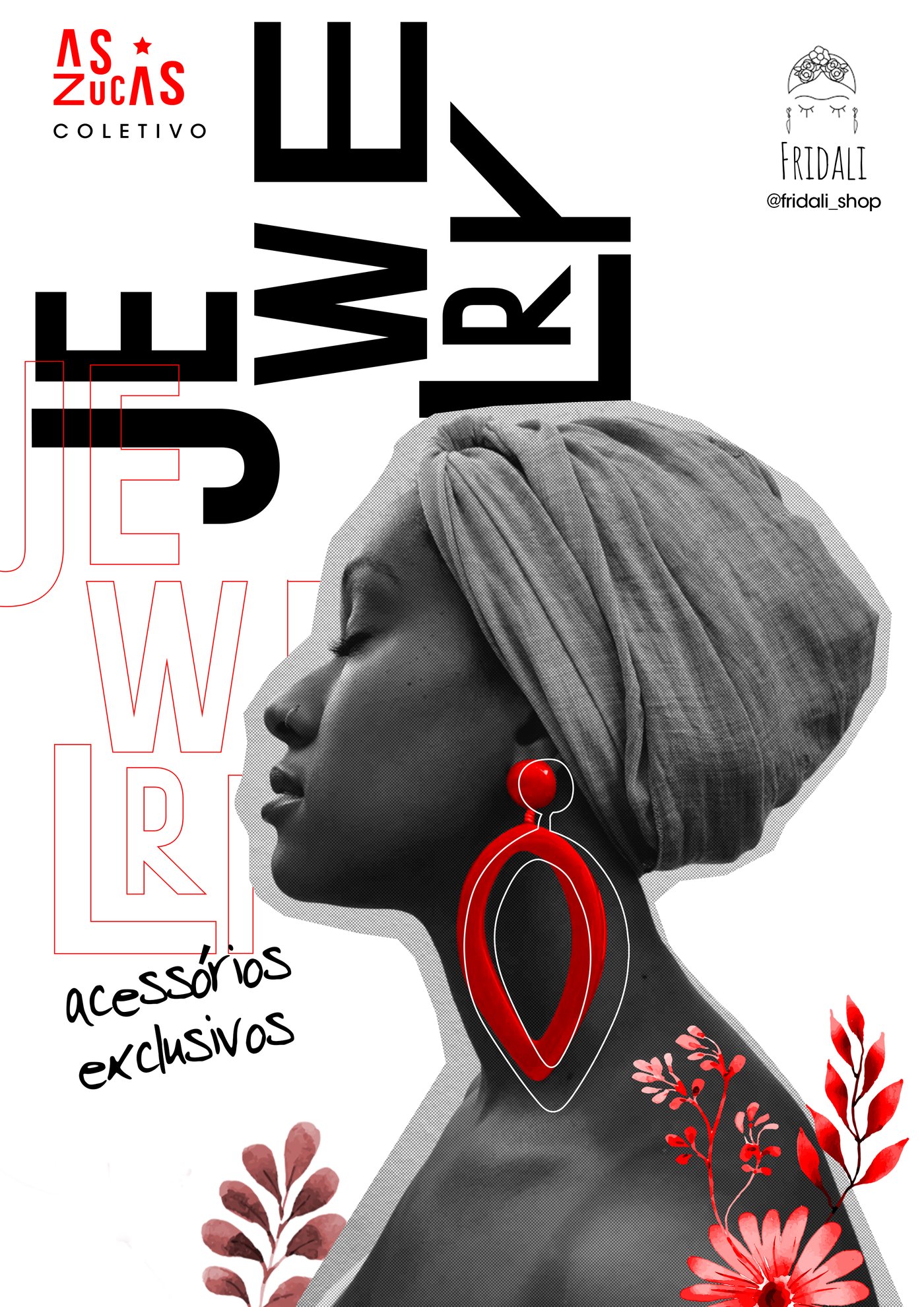
"Tá linda linda": a self-esteem poster series. As Zucas Coletivo × Fridali: a jewelry poster for the collective.