
The brief
Cris Carvalho communicates through three genuinely different formats (a podcast, courses, and one-on-one coaching), each with its own rhythm and audience expectation. A guideline built for just one of those would have left the other two improvising, so the brief was to define a system flexible enough to cover all three without feeling like three separate brands.

The avatar drawn with enough outfit and mood variations to read as one character across dozens of posts, not a single static logo.
A drawn avatar as the anchor
The centrepiece of the guideline is a custom-drawn avatar built around the person's own cheerful character, a deliberate choice, since personal-brand work lives or dies on whether the visual identity actually feels like the person behind it, rather than a generic template with their name swapped in. The avatar gave every format (podcast cover art, course slides, coaching materials) a consistent face to anchor around, using design thinking to keep the underlying decisions grounded in how each segment is actually used rather than how it looks in isolation.
Three formats, one system
Each format got its own templates and colour combinations while staying inside the same type rules and the same drawn avatar, so the podcast, the courses and the one-on-one mentorships read as one brand rather than three.
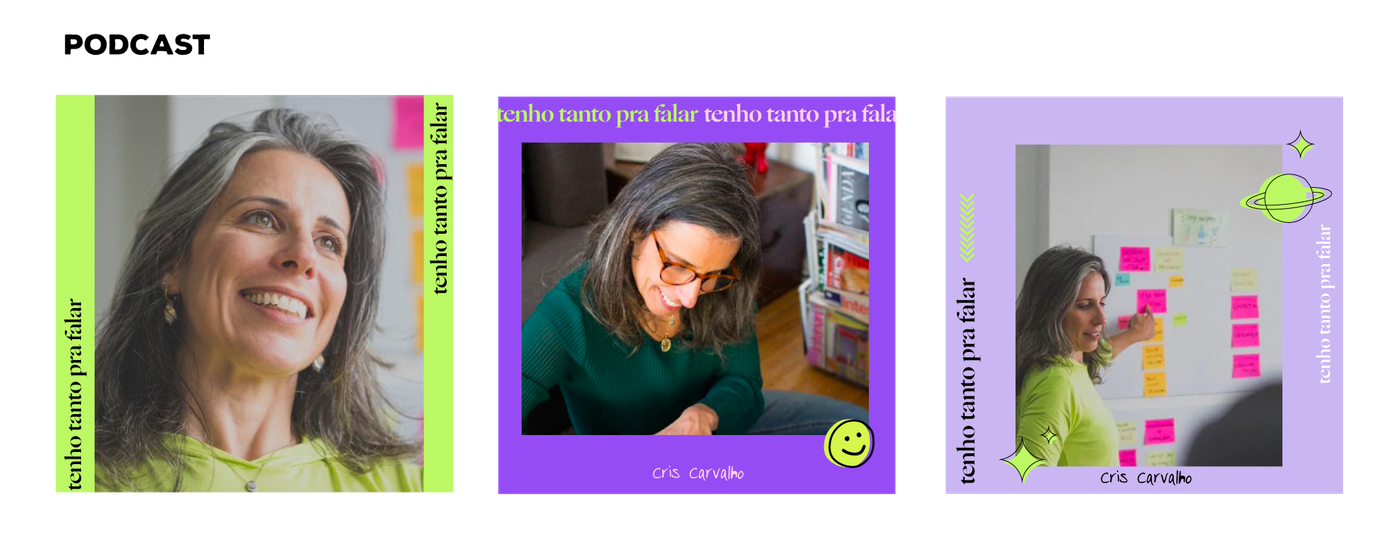
Podcast posts: real photos framed by the brand's colour blocks and a recurring headline.
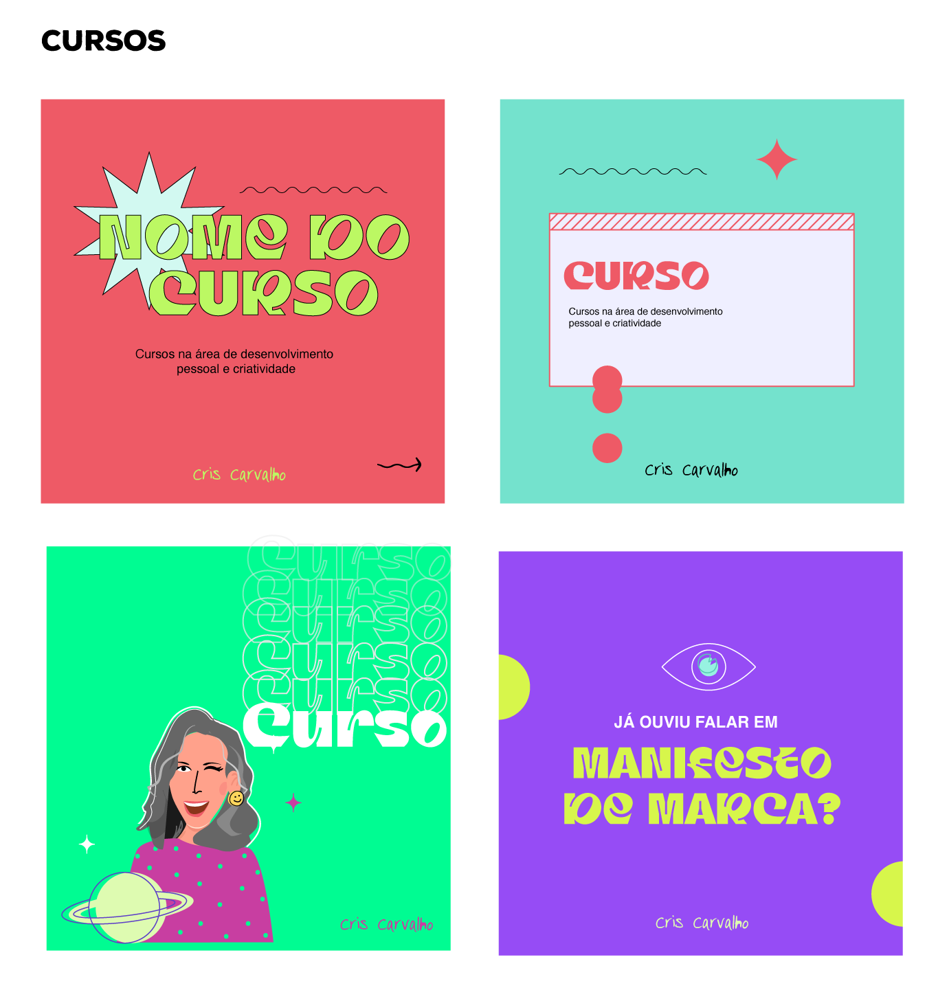
Course announcement templates: same avatar and type system, translated into a punchier, sales-facing tone.
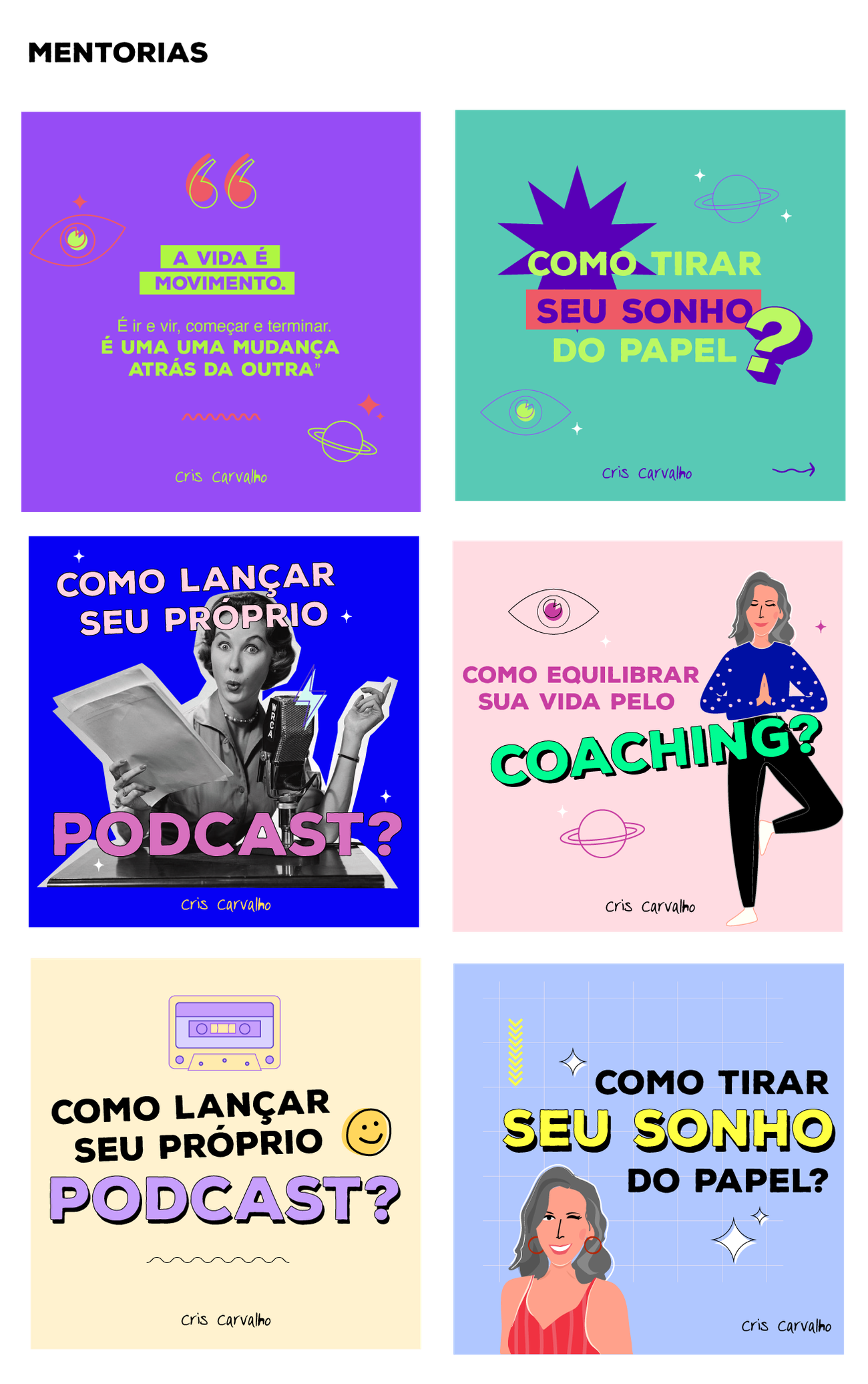
Mentorship posts: the most varied set, mixing stock photography and illustration while staying inside the same palette and type rules.
The website
The same guideline also had to hold up somewhere far more structured than a social feed: Cris's own website, hublifedesign.com. The purple-and-lime palette and the type pairing carry straight across, but the hero swaps the drawn avatar for real photography: a first-time visitor needs to trust a real person faster than a returning follower scrolling Instagram does. The "tenho tanto pra falar" podcast branding designed for the templates above reappears on the site's own podcast section, and the "IN & OUT" language behind Cris's coaching method (autoconhecimento profundo / posicionamento estratégico) is built into its own page section, split down the same purple/lime line as the rest of the identity, proof the system was built to scale past Instagram from the start, not patched together after the fact.