
The brief
Saltu started as a garden-design concept and needed to become an actual business, which meant design management across more than just visuals: figuring out what the brand stood for before deciding what it should look like. Working with Gustavo Almeida, Raquel Almeida, and Sofia Sousa, the identity explored the tension between utopia and dystopia through plant- and nature-driven visuals, using that friction as the actual creative territory rather than defaulting to a purely "green and peaceful" garden-brand cliché.
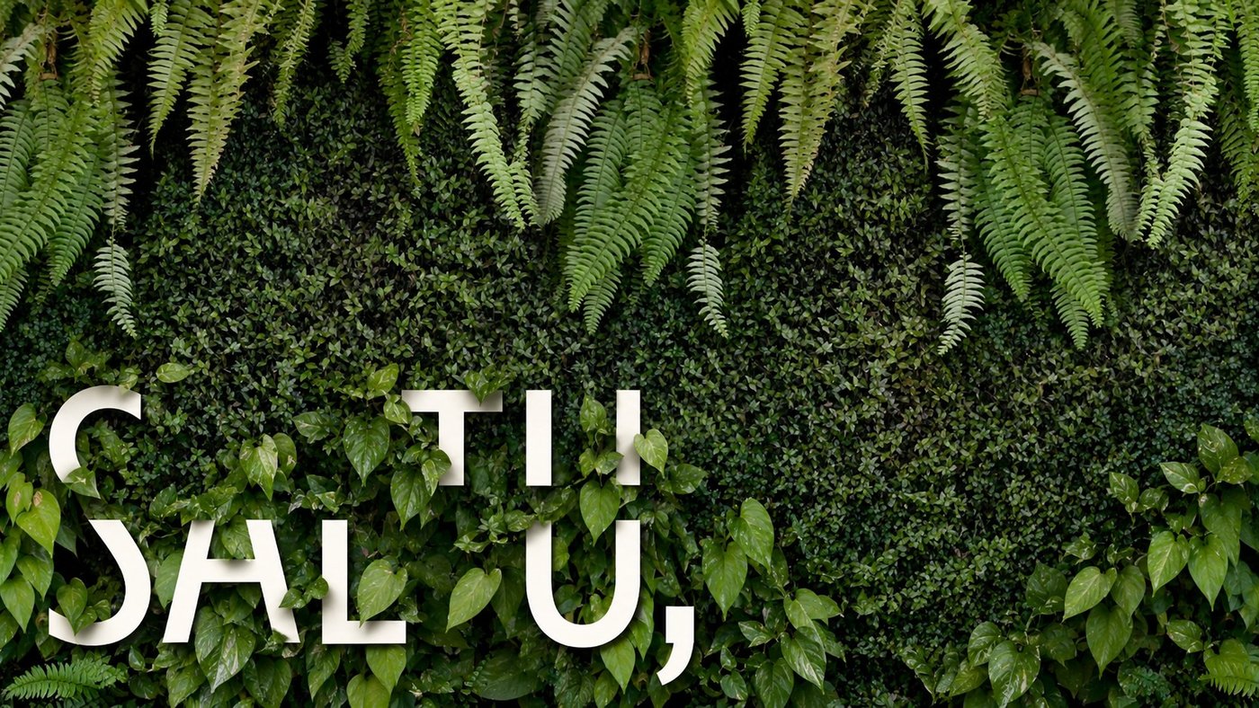
The wordmark leans on the comma-as-leaf mark that recurs across every application, set against real planted walls rather than illustrated greenery.
Design management, not just design
Taking a concept to a business means the design work has to answer questions a single visual never resolves alone: what does this look like as a logo, a proposal document, a planting plan, a client-facing presentation? Managing that meant sequencing the identity work so the earliest, highest-leverage decisions (naming direction, core palette, the utopia/dystopia tension) were locked before the team spent time on lower-level applications that would need to be redone if those changed.
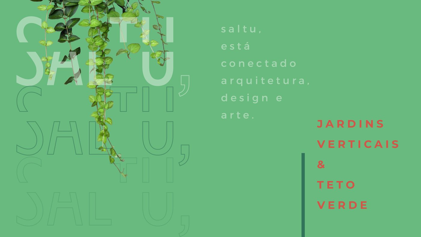
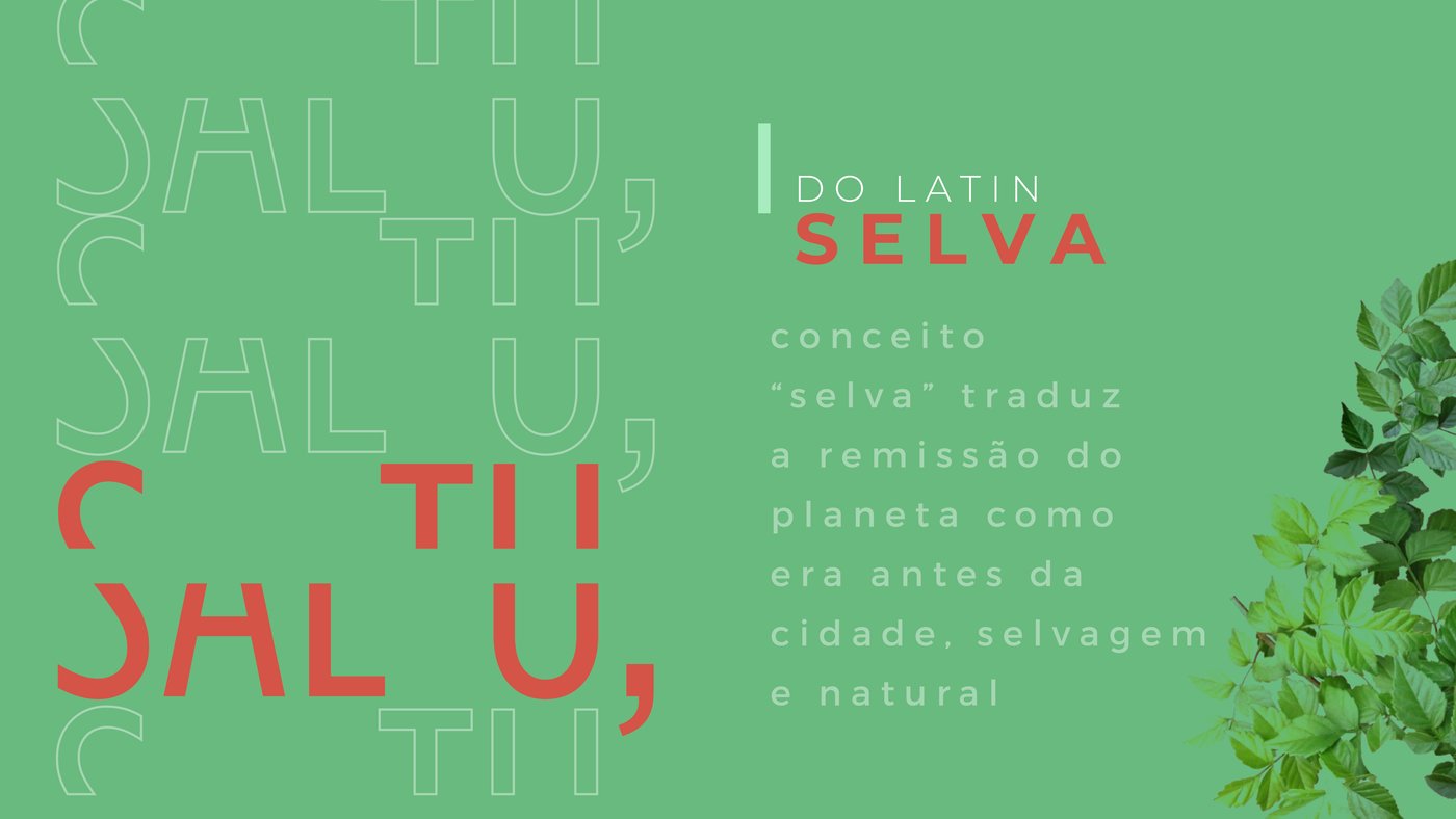
The naming and positioning logic: Saltu traces to the Latin "selva" (jungle), the wild the city paved over, not a generic garden-brand cliché.
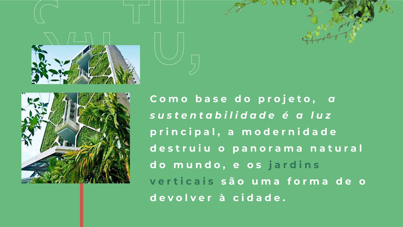
The service itself: vertical gardens and green roofs as a way of giving planted space back to dense cities.
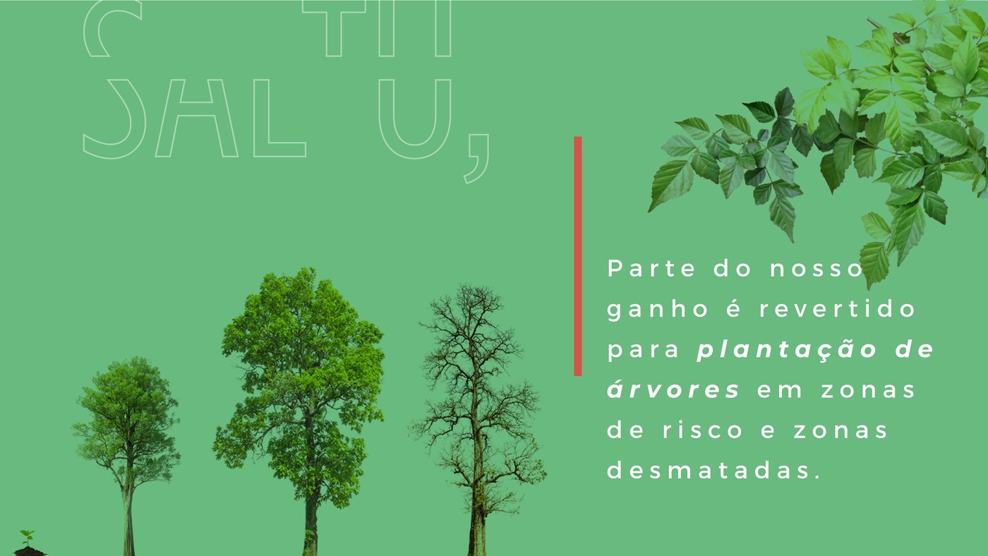
The give-back built into the model: a share of revenue funds tree planting in deforested and at-risk areas.
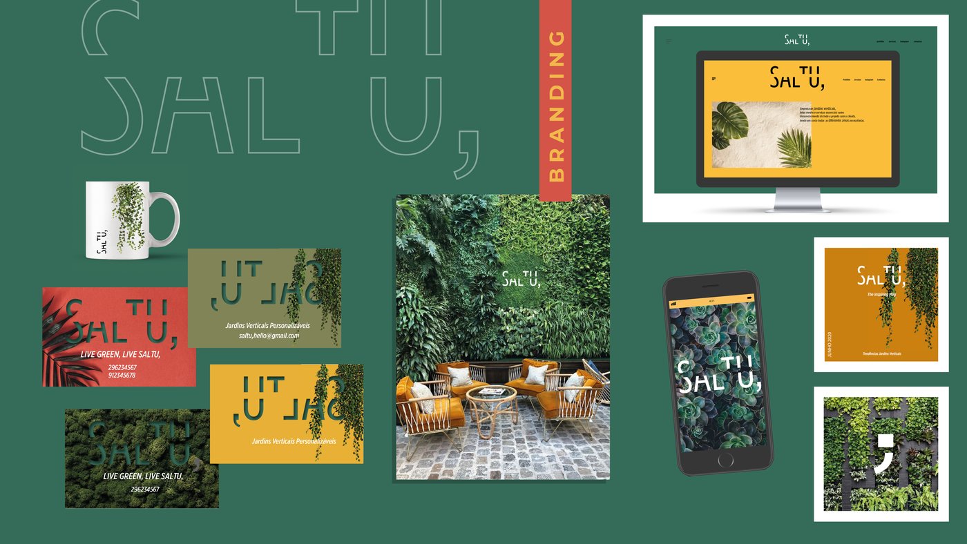
The identity carried across the applications a real business actually needs: stationery, site, mobile, print and merchandise.