
The brief
Medicinal cannabis sits in a genuinely awkward visual space: too much stoner iconography and it undermines its own medical credibility; too much clinical sterility and it loses the plant-based, natural positioning that's actually the point. The brief (logo, full visual identity manual, and stationery) had to navigate that middle ground directly, treating hemp-based treatment as a legitimate, approachable part of healthcare rather than leaning on either cliché.
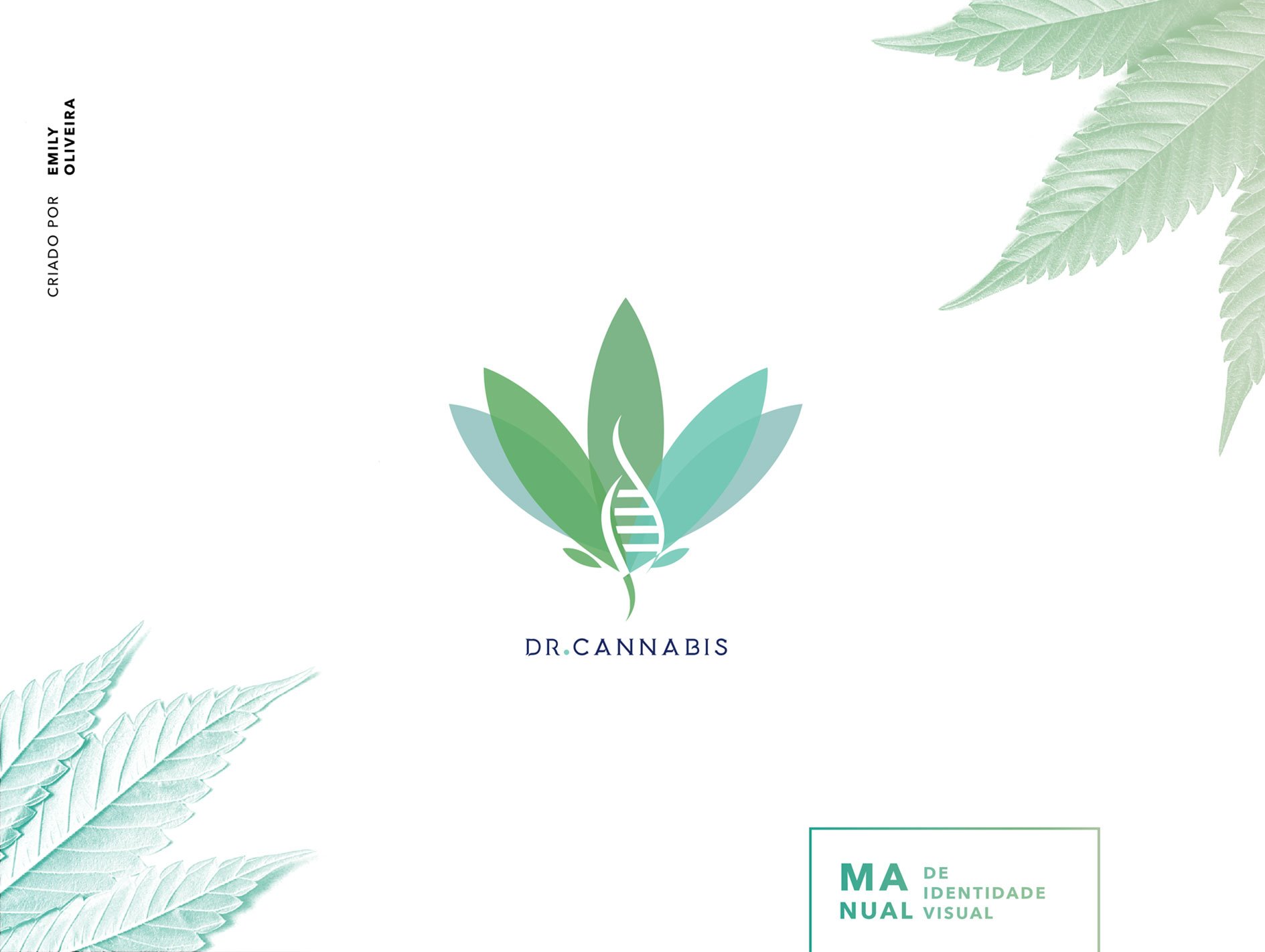
The identity manual's cover: a cannabis leaf built around a DNA helix, gradient-toned from green to teal.
From sketch to symbol
The mark started as a hand-drawn sketch of the leaf shape before being redrawn in vector, a step that kept the final logo's proportions organic rather than mechanically symmetrical, important for a plant-based brand that still needed to look considered and professional rather than casual.
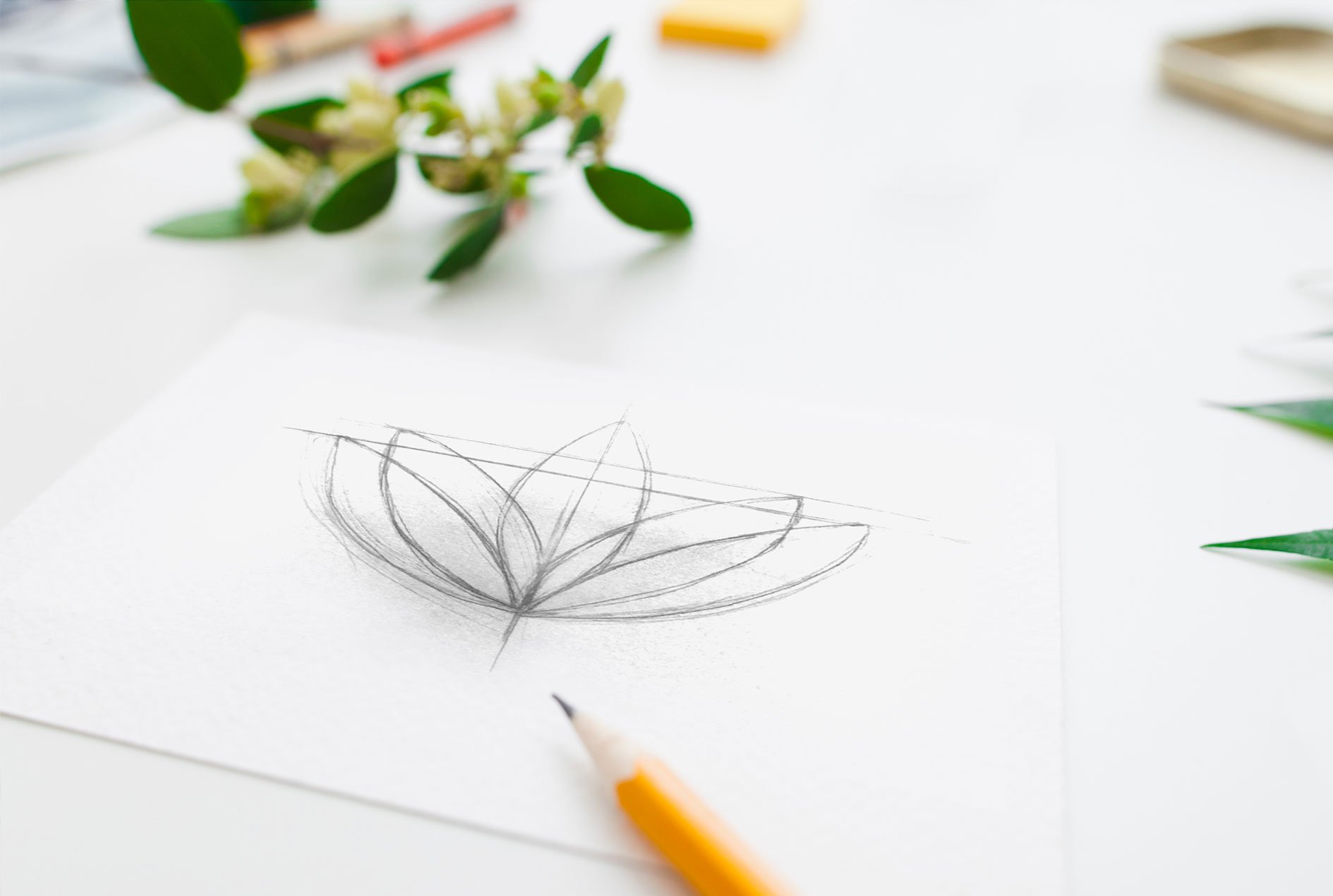
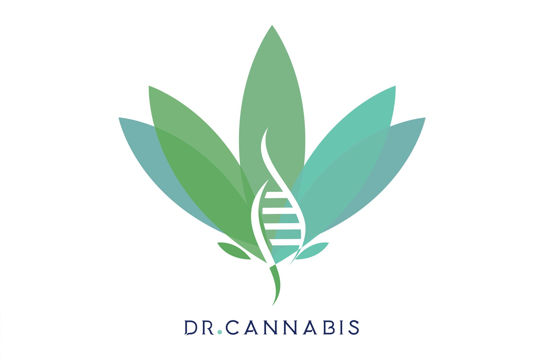
Sketch to final vector: the leaf's five layered petals fade from green to teal, with a white DNA strand running through the center to bring in the "Dr" side of the name.
Designing for credibility first
The logo and presentation materials were built to read first as a healthcare brand and second as a cannabis brand, a deliberate ordering, since the audience for medicinal cannabis products is often people who need to be persuaded of its legitimacy before anything else about the brand matters to them. The DNA helix at the center of the leaf carries that science-first framing directly into the mark itself, and the navy wordmark (rather than an all-green treatment) keeps the logo grounded in a more clinical, trustworthy register.
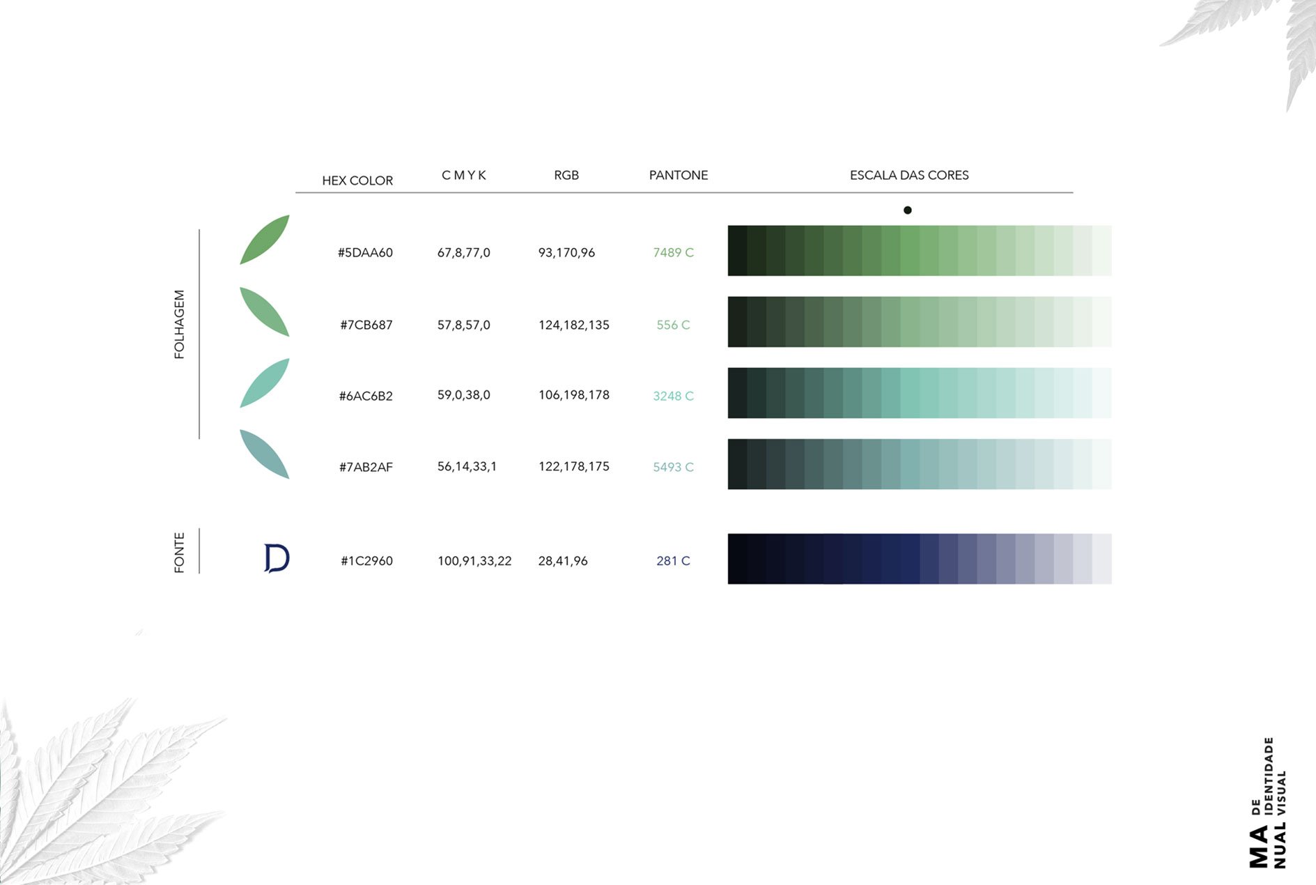
The palette: four foliage tones moving from green to teal, paired with a single navy for type, muted enough to feel clinical, not a full "cannabis green" treatment.
Applied to stationery
The same mark and palette carried onto business cards and app/phone-screen mockups, kept simple enough that the logo does the work on its own rather than needing extra graphic support to read as a legitimate healthcare brand.
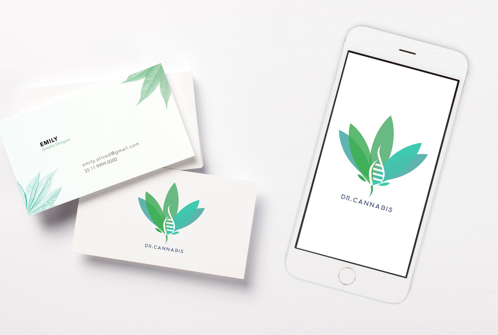
Business cards and app splash screen: same logo, same restrained palette.