
The problem
MyFaceClinic is a multidisciplinary aesthetics clinic with 1,944 procedures behind it, reputation was never the issue. But Capillus, its hair-transplant sub-brand, had almost no real visibility on the main site: no dedicated space, no clear path for someone trying to evaluate a clinic for a procedure like this. Built as "Project 360" during the EDIT UX/UI programme, this was a full redesign taken all the way through to an interactive Figma prototype rather than stopping at static screens.
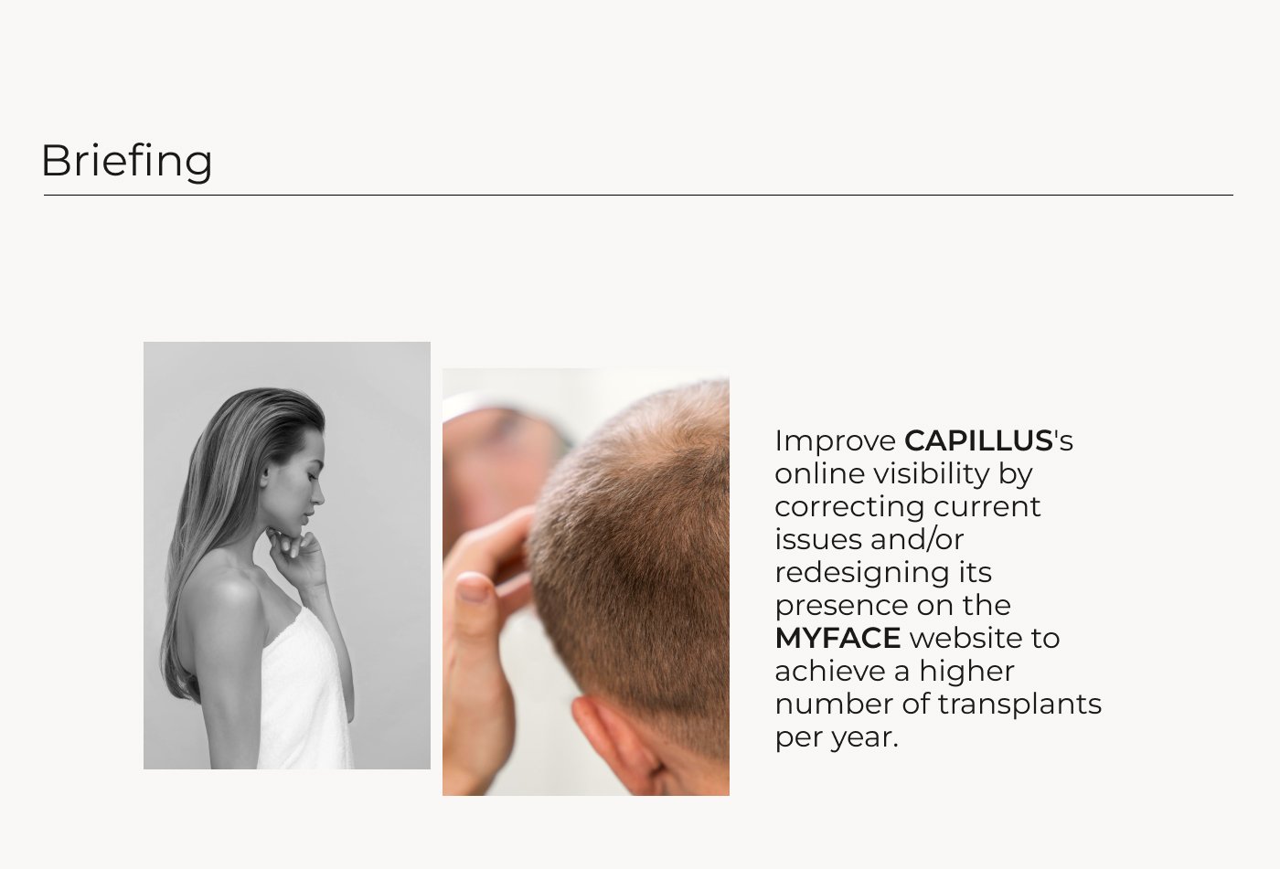
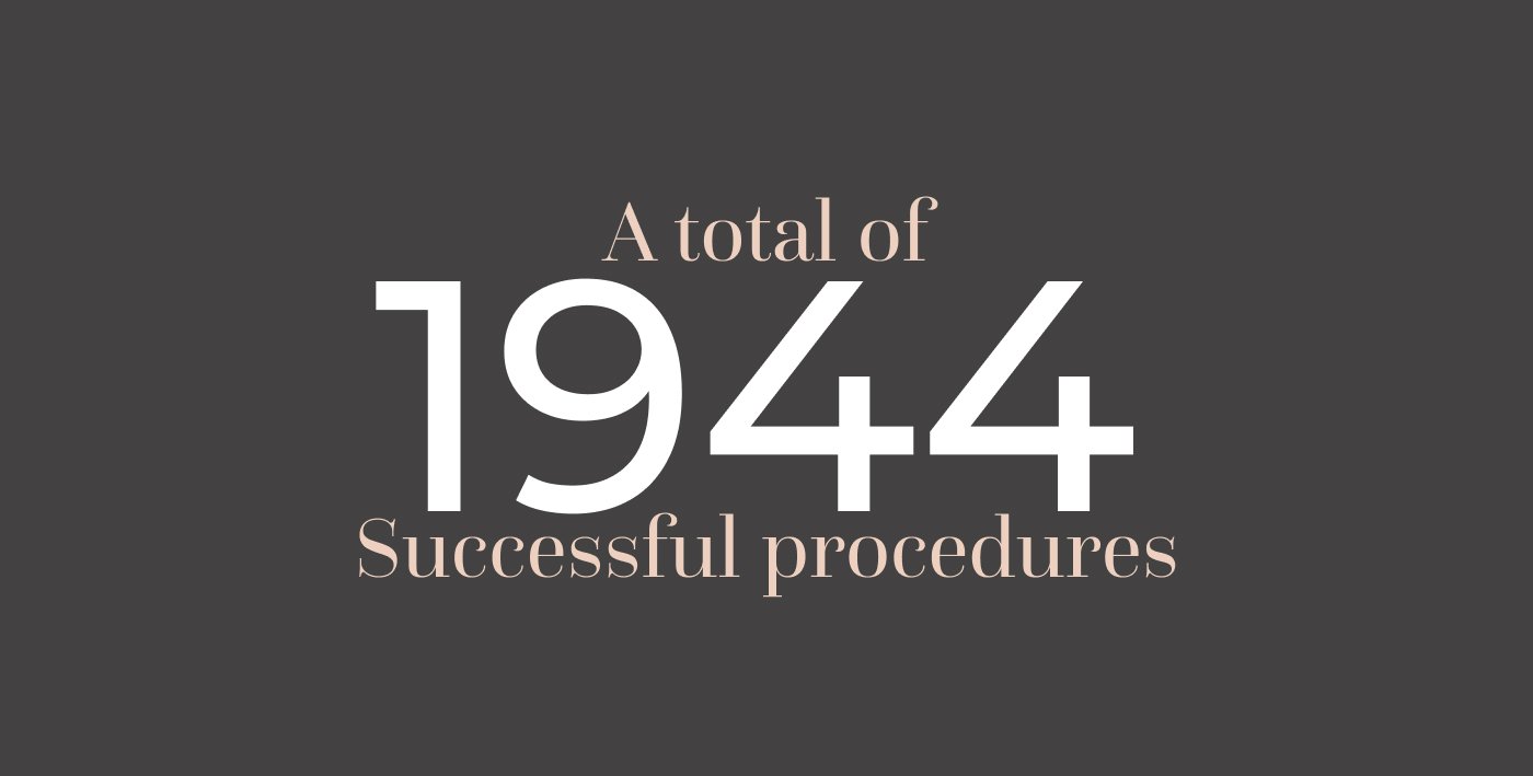
The brief and the clinic's own scale going in: reputation was never the problem, findability was.
My role & approach
End-to-end: research, IA, wireframes, UI and the final clickable prototype, working the double-diamond rather than jumping straight to screens.
- Understand: 7 user interviews and a 45-response survey, plus a competitive benchmark and usability testing on the existing site.
- Explore: a persona and problem statement built directly from that research, used to keep every later decision anchored to a real user rather than a personal preference.
- Realize: the redesign itself, then a second round of usability testing on the prototype to check the fix actually worked.
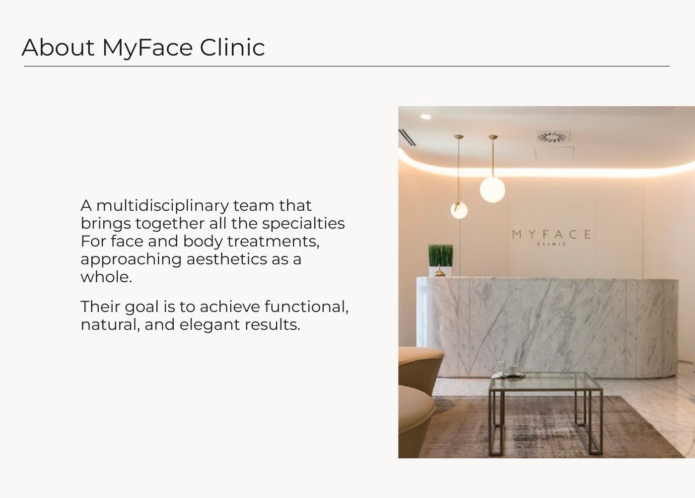
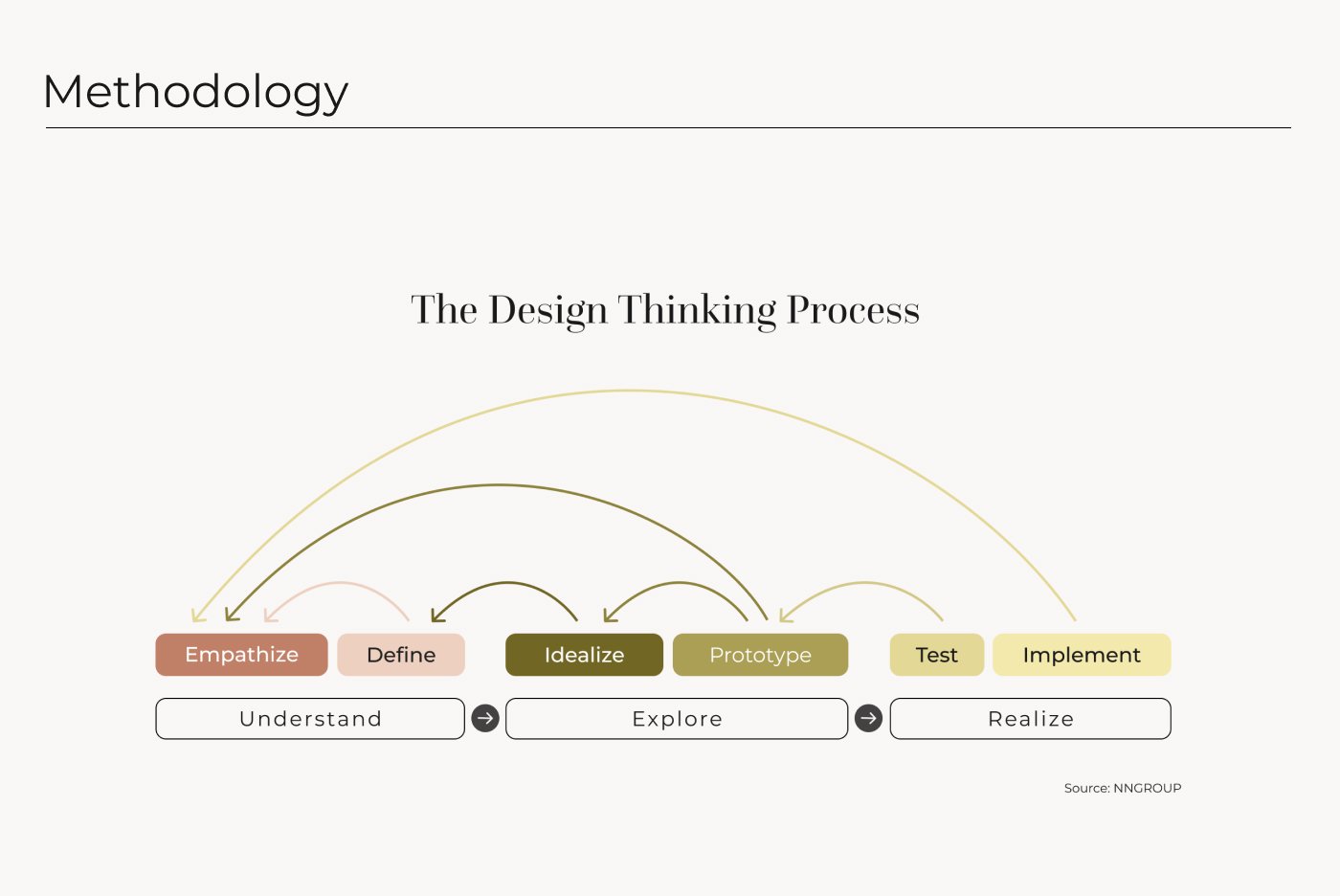
The client, and the double-diamond process used to get from brief to prototype.
Research
The interviews and survey converged on the same thing: people considering a hair transplant want transparency before anything else, clear information, real results, an honest sense of what to expect, and MyFaceCapillus wasn't giving them that. That surfaced most clearly in a persona built to keep the rest of the process honest.
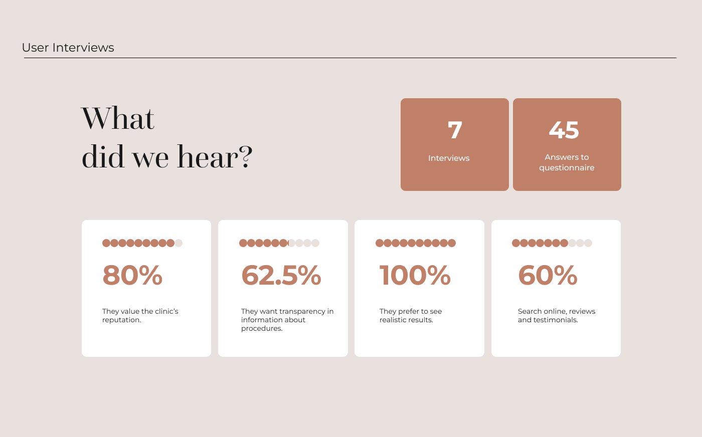
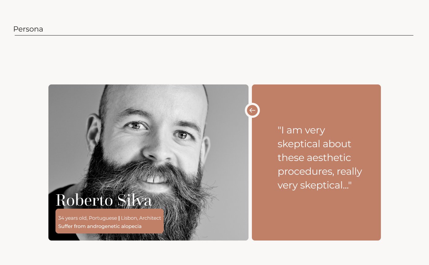
Seven interviews and 45 survey answers distilled into a persona: Roberto, skeptical and looking for transparency.
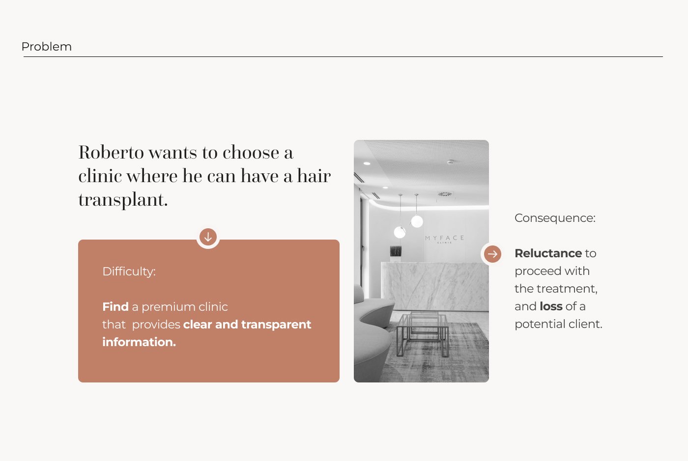
The problem statement that guided every decision after.
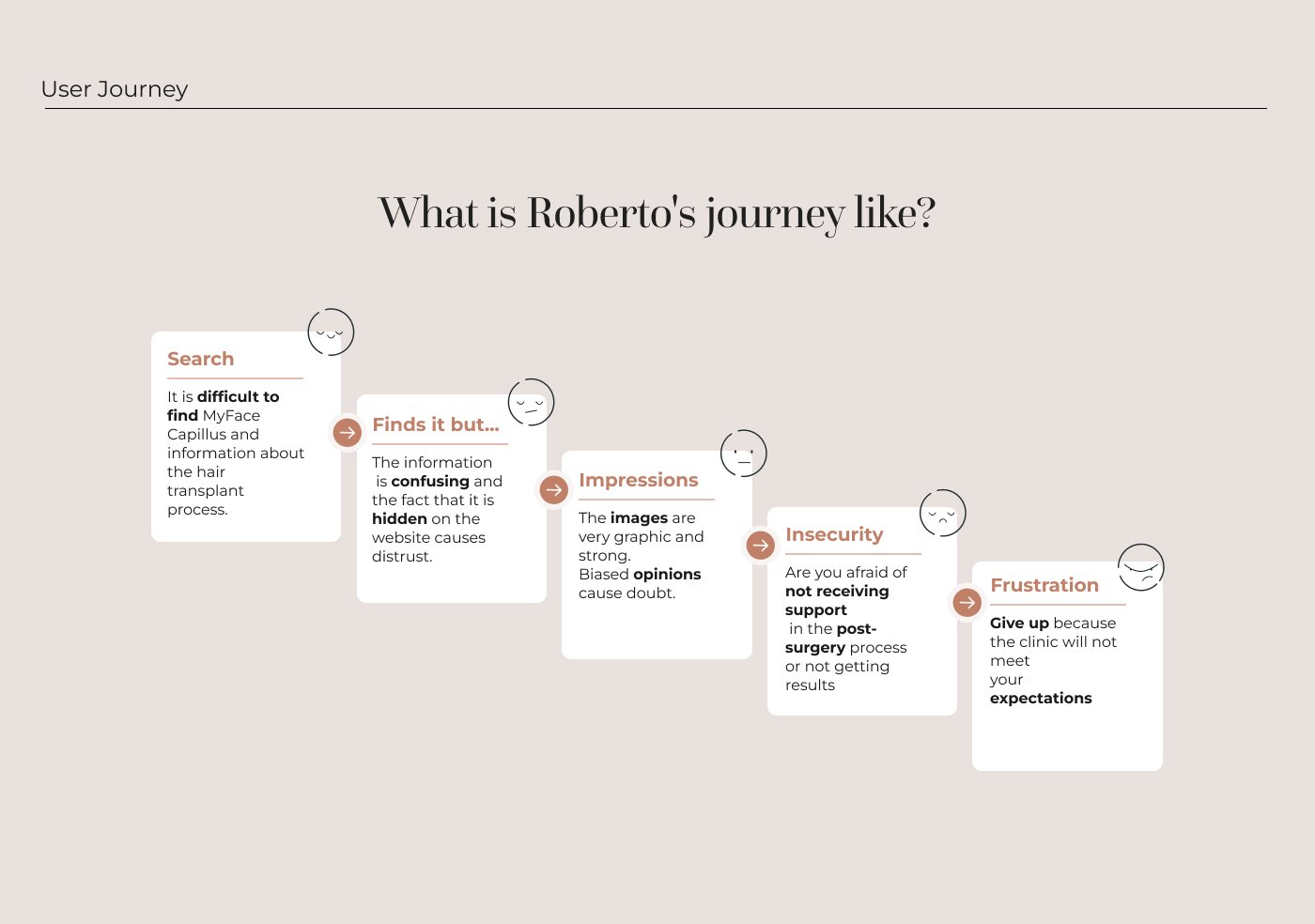
Roberto's journey from search to frustration: five stages of a broken experience.
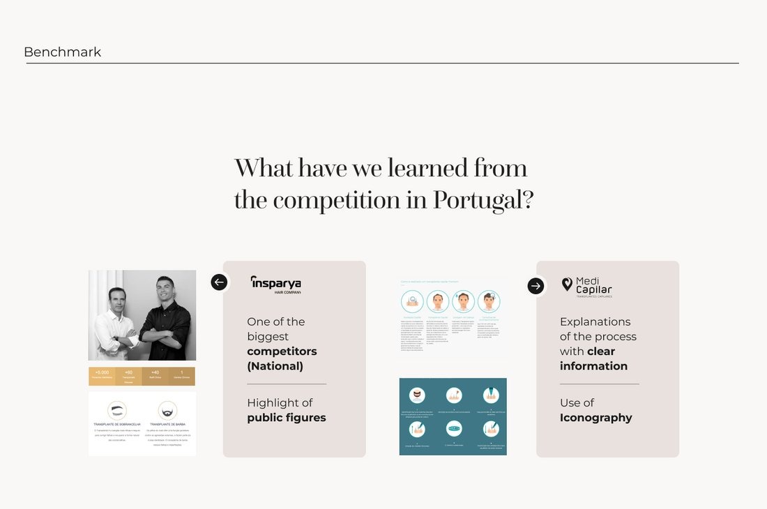
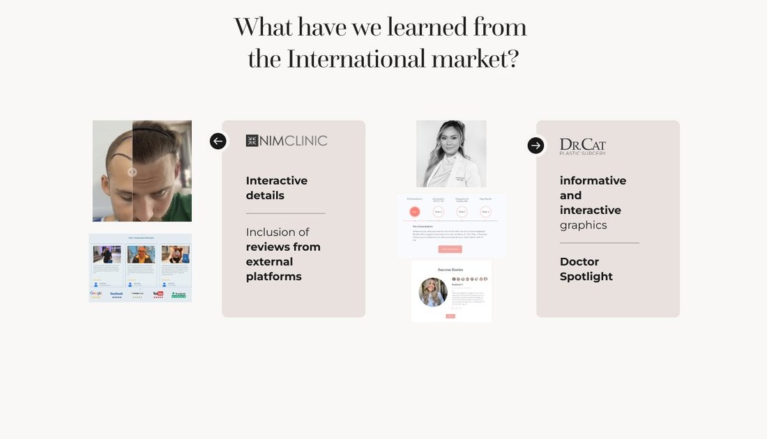
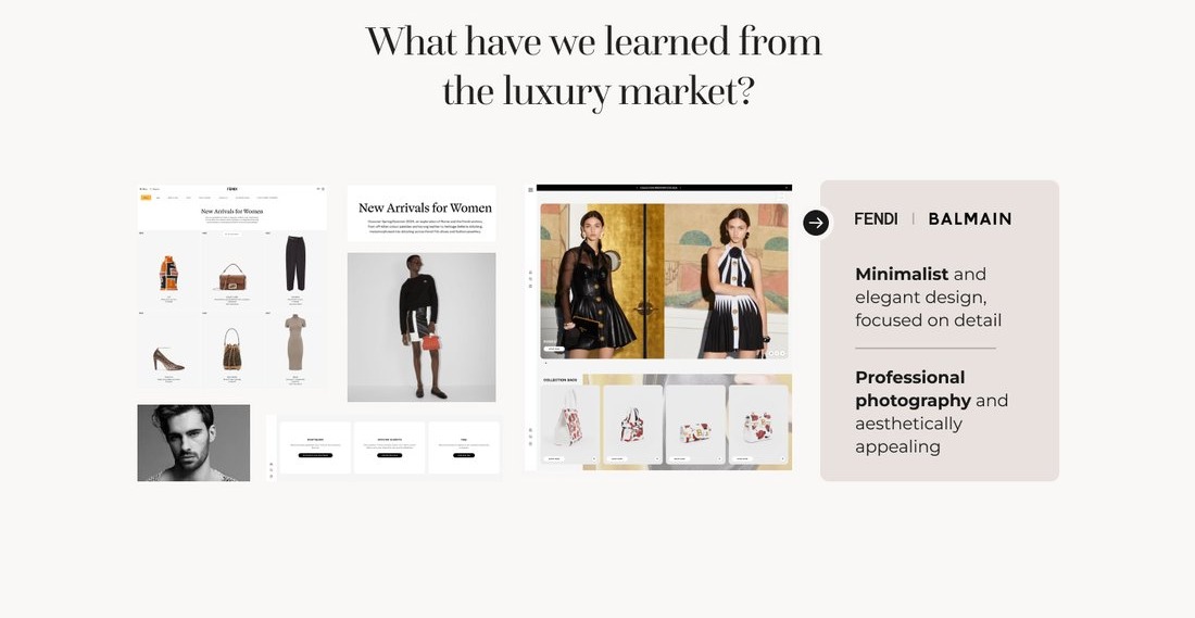
Three tiers of benchmark, three different levers: national competitors leaned on public-figure endorsements, international clinics on interactive detail and reviews, luxury brands on minimalist, editorial photography.
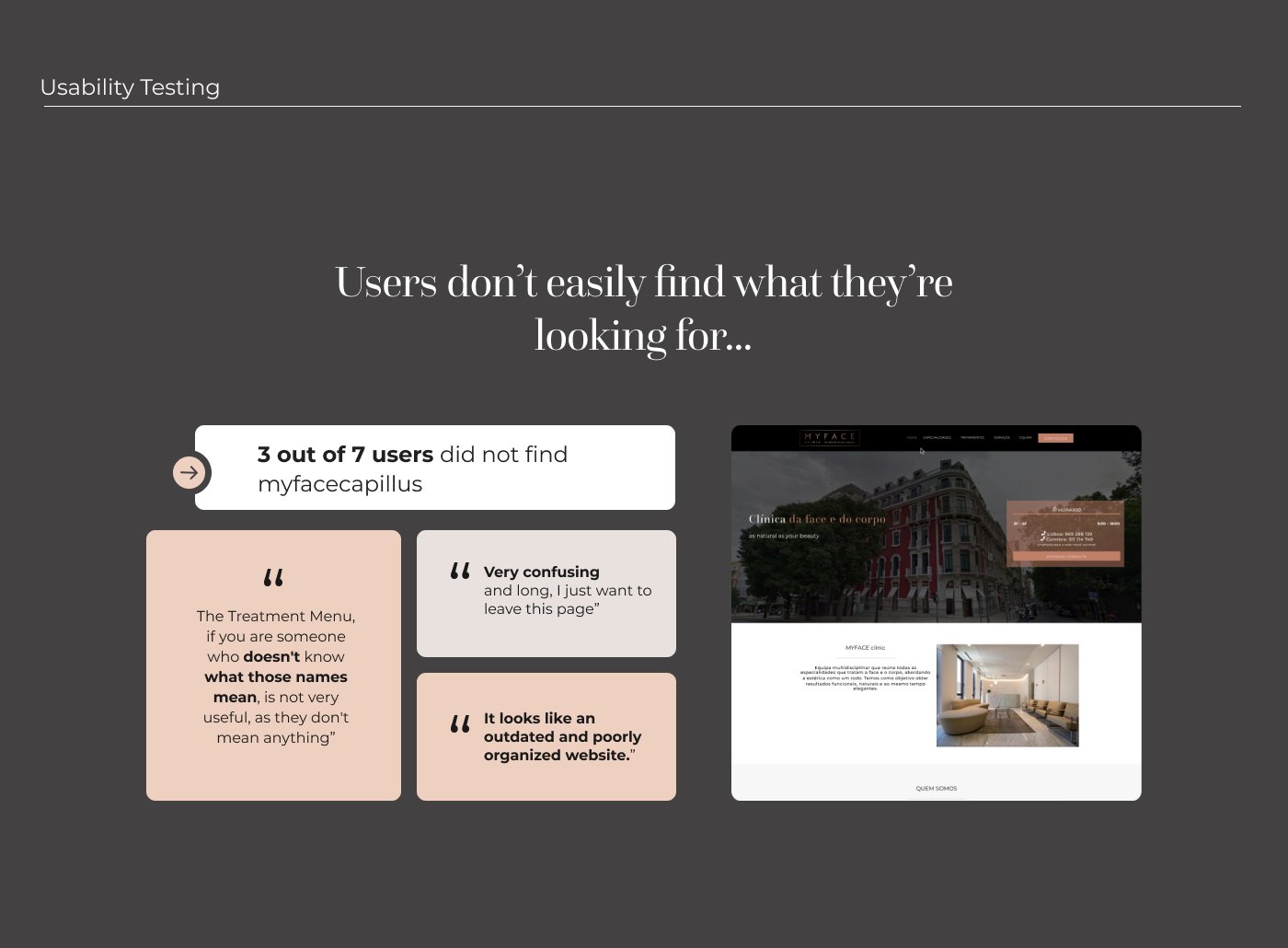
Usability testing on the live site confirmed the problem was real: 3 of 7 users couldn't even find MyFaceCapillus.
Why a full prototype, not just screens
A static set of screens can hide a lot of unresolved decisions behind pretty layouts. Building the full clickable flow meant confronting edge cases and secondary paths early: what happens after this action, what does an empty state look like, how does someone get back if they change their mind, rather than deferring those questions to a later handoff stage.
The proposal: an elegant, sophisticated look, paired with clear information.
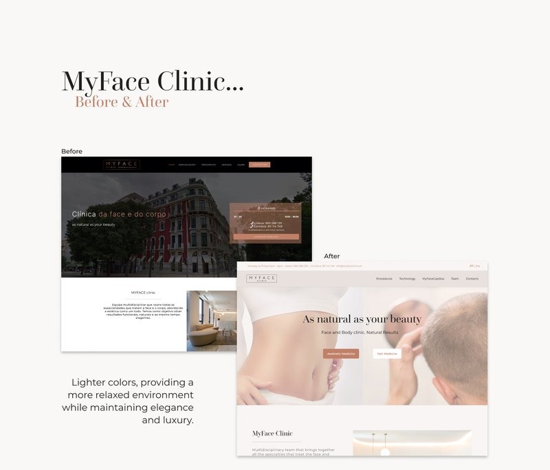
Homepage before and after: lighter colors read as more relaxed without losing the clinic's elegance.
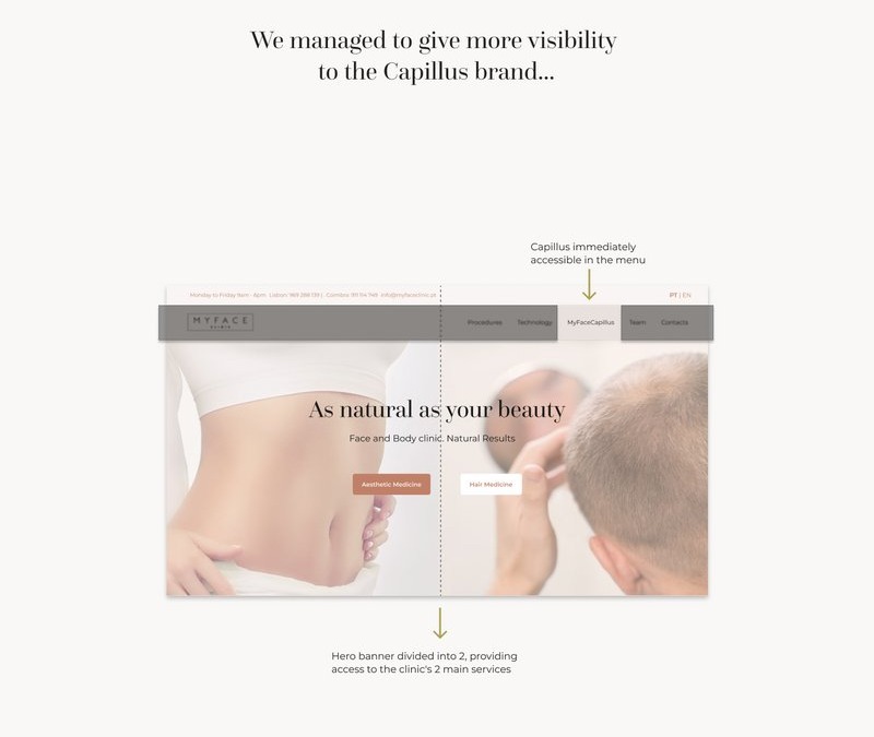
The hero splits into the clinic's two main services, and Capillus becomes a first-class item in the main menu instead of being buried.
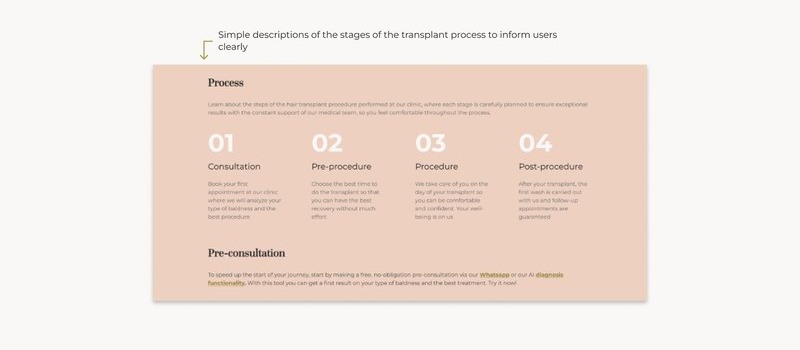
The transplant process broken into four plain-language steps, so people know what to expect before ever booking.
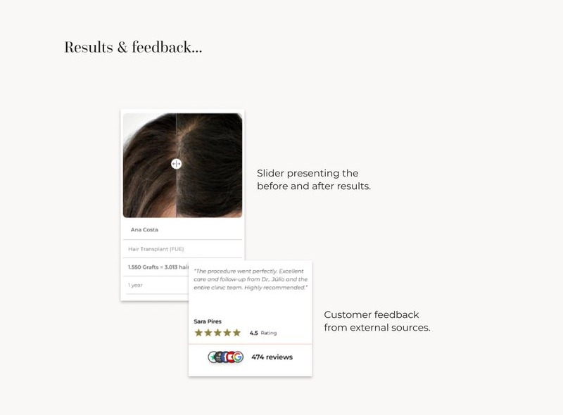
A before/after slider for real results, plus reviews pulled in from external platforms for outside credibility.
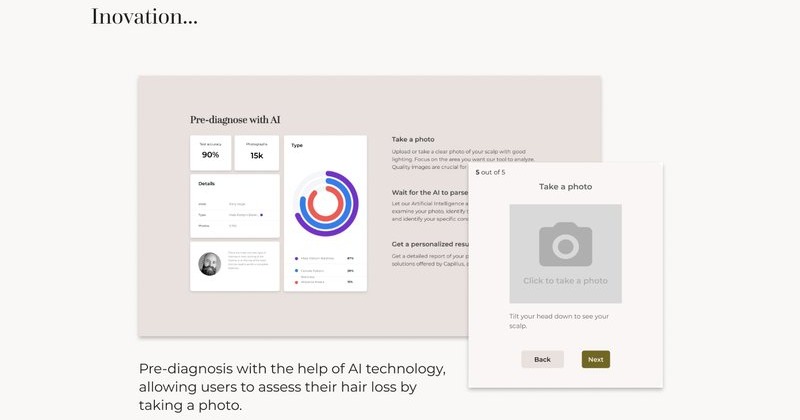
An AI pre-diagnosis tool lets people photograph their scalp and get an initial read on hair loss before ever booking a visit.
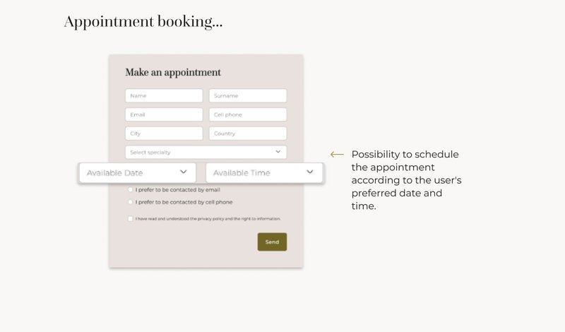
Booking closes the loop: pick a date and time, choose how to be contacted, and send.
Outcomes
Retesting the prototype with the same kind of users closed the loop on the original research:
- Every task was completed faster than on the original site.
- Users specifically called out the clearer hierarchy and the sticky menu.
- The 4 conclusions the whole process pointed to: a user-centered approach, easier navigation, organized and hierarchized information, and transparency in content, were the same ones the redesign had been built around from the start.
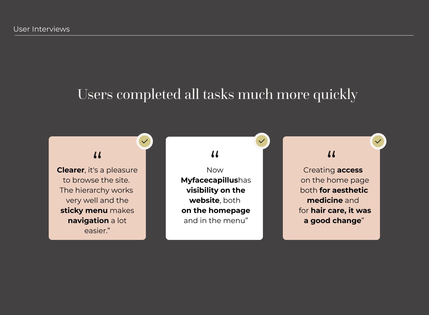
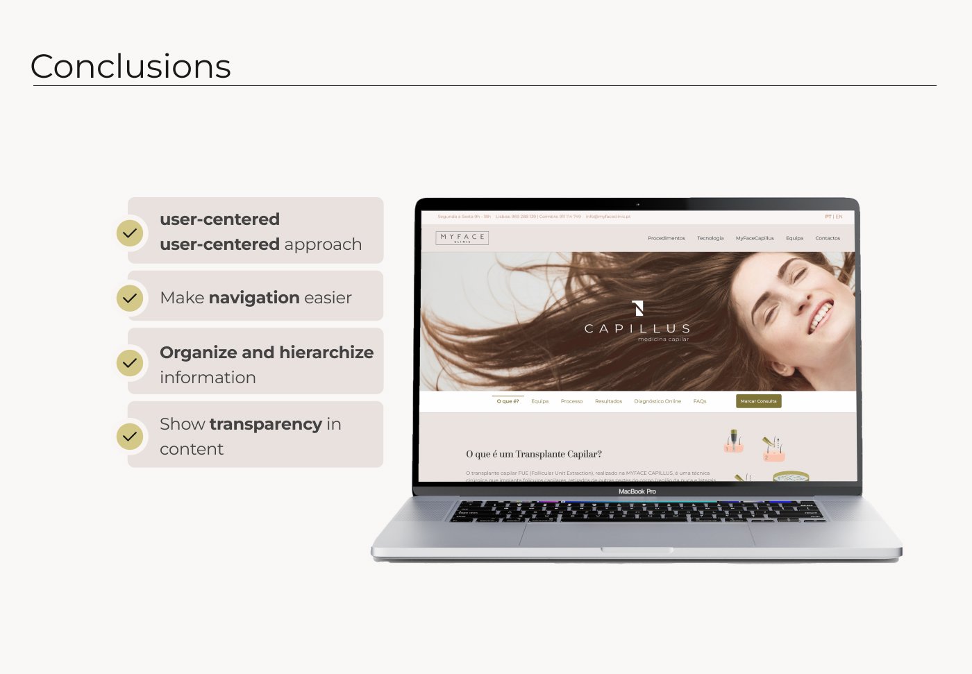
Retested after the redesign: users completed every task faster, confirming the four conclusions the whole process pointed to.
Reflection
Working the full flow through to a clickable prototype, instead of stopping at a handful of key screens, is what forced the real decisions to surface, every state had to exist, not just the happy path. Going back to the original research at the retest stage, rather than just trusting that the redesign "looked right," is the habit from this project I've carried into every case study since.