
The brief
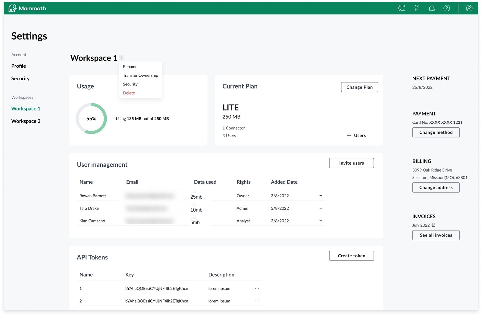
Mammoth's settings used to live on a single page: plan, billing, storage, users and API tokens all stacked into one "Workspace" screen, with account-level actions hidden behind a small overflow menu. Settings pages tend to accumulate this way: Roles & Permissions today, Security, Billing and Integrations tomorrow, and designing just one more section onto that page would have meant re-deriving the shell's rules from scratch each time. The brief was to research how a settings area should actually be organised, then design and prototype the information architecture once, properly.
Research: who this is for
Before touching the IA, we mapped the people who actually live inside a Mammoth workspace day to day: from solo freelancers managing client projects to analysts inside larger institutions. Each persona put different pressure on the settings area: some needed fine-grained roles and permissions, others just wanted to see plan and storage at a glance without digging.
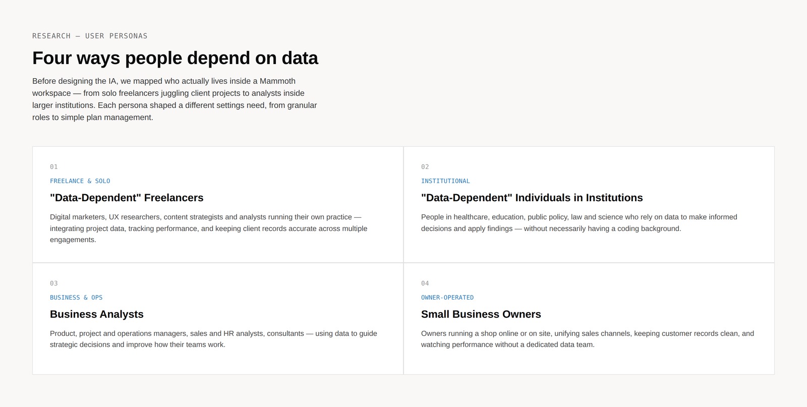
Four persona categories, each pulling the settings IA in a slightly different direction.
From one page to a proper sitemap
The fix started as an information-architecture problem, not a visual one: group everything under Settings into clear sections: Account, Team, Integrations, Plan, Preferences, Security, each with its own sub-pages, instead of one long scroll with a menu bolted on.
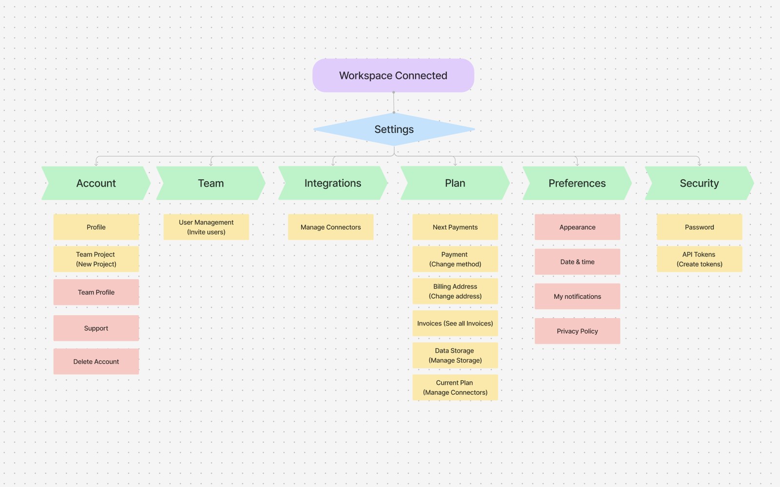
The sitemap that replaced a flat page: six clear sections, each scoped to one job.
Before / after
The old workspace settings page crammed plan, usage, billing, users and API tokens into a single dense screen, with account-level actions (rename, transfer ownership, delete) buried behind a small overflow menu. Most of it wasn't visibly broken, which made it easy to leave alone; it took a focus group to show how much was actually hidden. Session after session, people scrolled past three unrelated sections hunting for something that should have taken one glance, or didn't realise a setting existed until we pointed at it. That gap between what was on the page and what people actually needed is what shaped the redesign: a dedicated, scannable General overview with its own sidebar, and the dense detail moved into sections of its own.
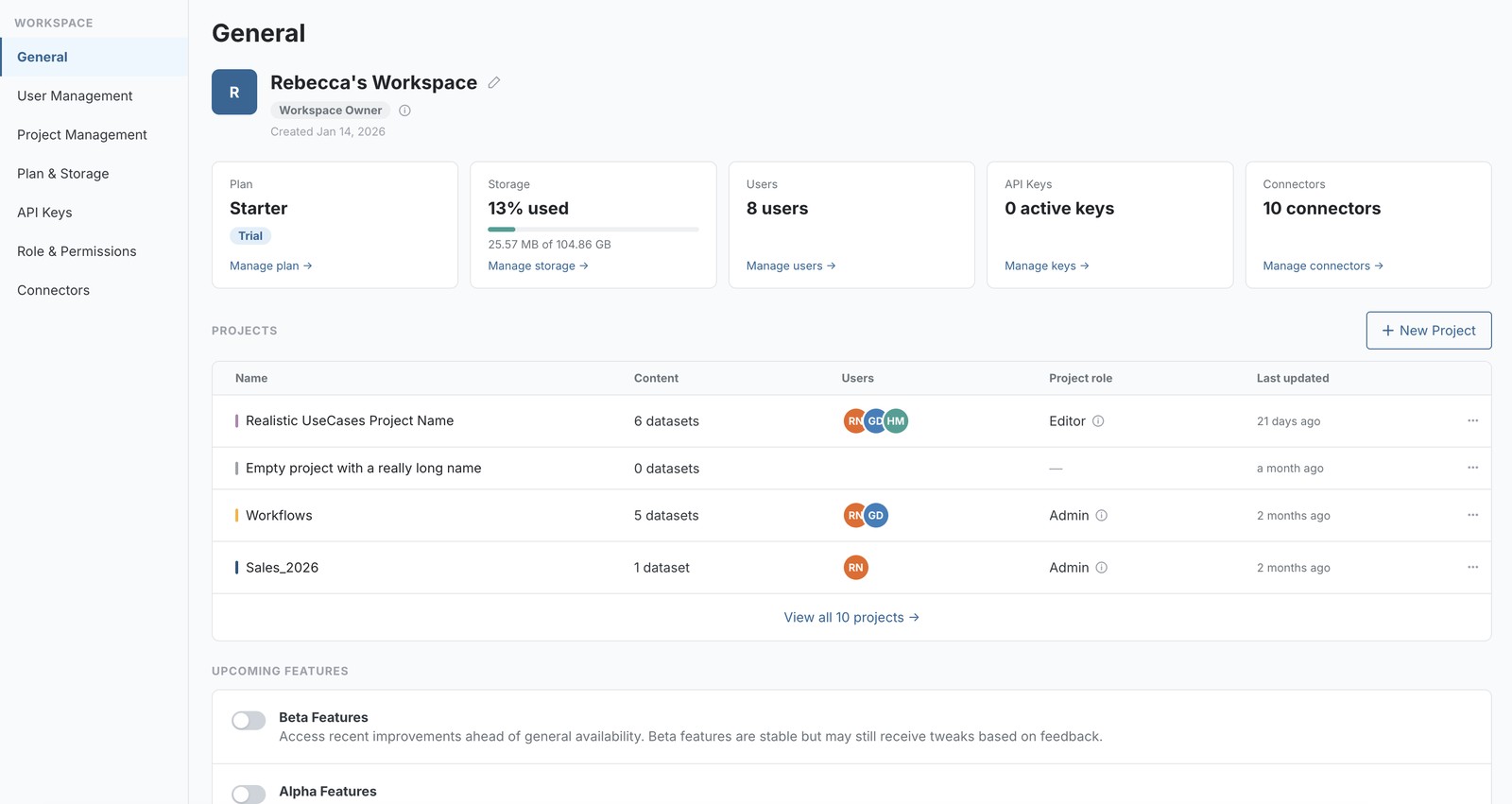
The same research surfaced a shell-level problem, not just a content one: which workspace you're in is a decision people make constantly, but it was buried inside a single settings page instead of living in the navigation. We pulled it up into the shell itself: a workspace switcher that's always reachable from any screen, not just Settings, and collapsible so it stays out of the way once you've made the choice.
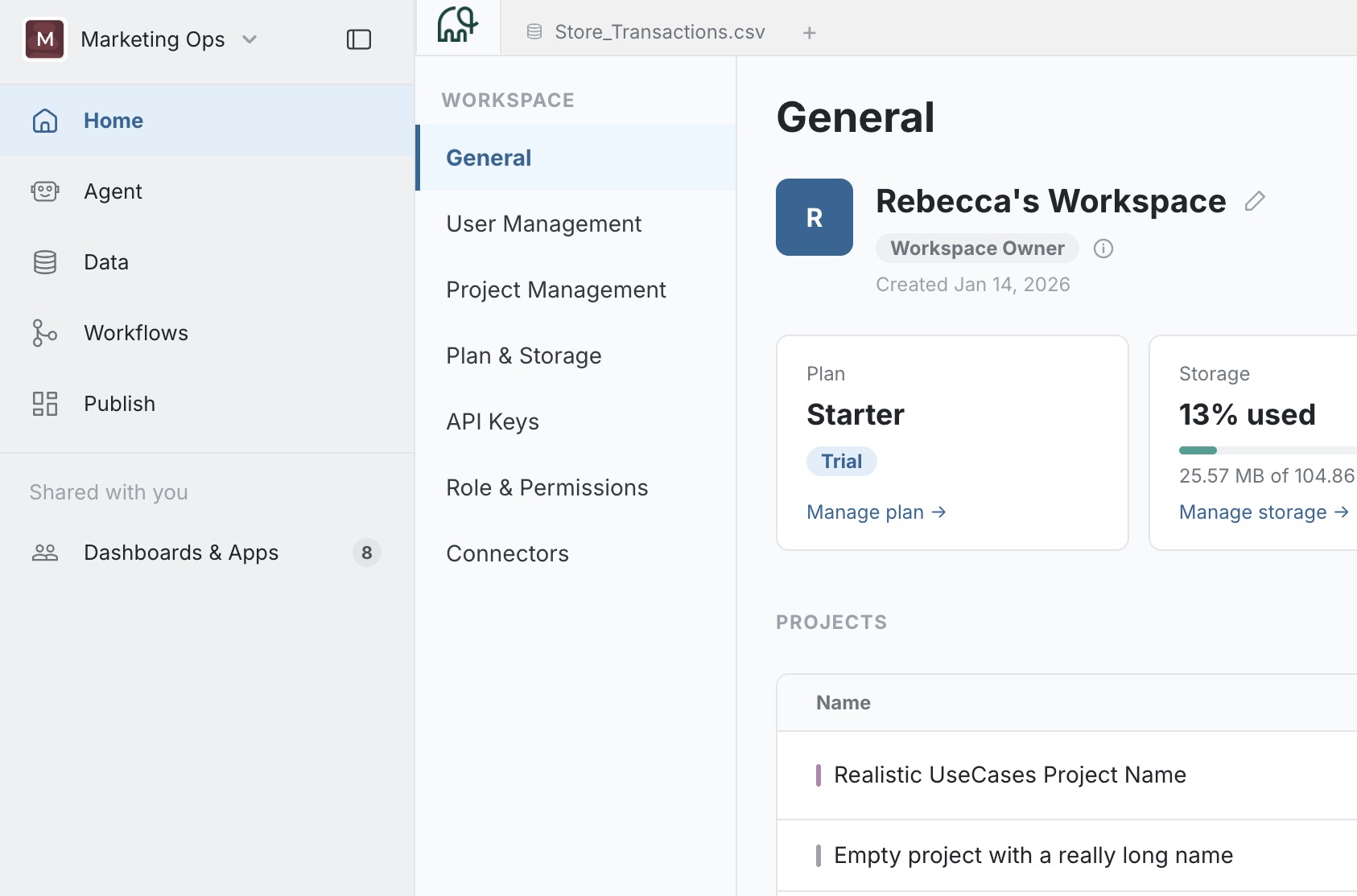
The workspace switcher promoted to the shell: reachable from anywhere, and collapsible so it doesn't compete with the page underneath it.
Separating shell from content, explicitly
The final structure draws a hard line: everything outside the white content panel (the browser-style tab bar across the top, the icon-only left nav, the settings-specific sidebar) is shell, shared across every settings page. Only the content panel changes per page. Documenting that boundary explicitly (not just building it that way) mattered, because it's what let a specification for one page (Roles & Permissions) be handed off without anyone assuming the whole shell was up for revision too.
Where a nav item belongs is an IA question, not a visual one
A related debate came up designing the docs/product IA: whether an admin-focused item ("Workspace & Settings") belongs inside the main navigation at all. The instinct to tuck admin content wherever there's space is exactly what makes navigation hard to trust; we pushed to resolve it structurally instead: does this belong in the same journey as the core workflow, or is it a different kind of task that deserves its own, clearly separate place? It landed as its own labelled item rather than force-fit into an existing section it didn't really belong to.
Prototyping the flow
The IA was built out as a fully working HTML/CSS/JS prototype (every tab, modal and state clickable, not just a set of static screens), prototyped with Claude's help alongside the Mammoth design team. A few moments from it:
Designed and researched by the Mammoth UX design team; prototyped with Claude's help.