
The problem
EDIT's own training managers were coordinating everything (schedules, tutors, student records, payments) across a scramble of disconnected tools: Skype, WhatsApp, email, spreadsheets. Too many channels for too many kinds of information meant things slipped through, and the tools available were, in the team's own words, either unintuitive, slow, expensive or confusing. The brief: propose a single platform, purpose-built for EDIT's own processes, and go through the full process to get there rather than jump straight to screens.
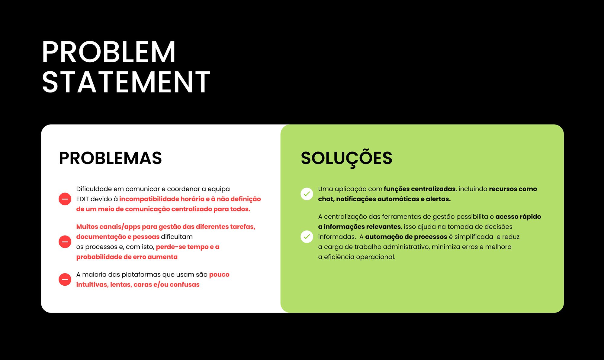
Problem → solution, stated plainly before any screen got drawn.
My role & approach
End-to-end again: research plan, desk research, competitive analysis, interviews, card sorting, persona and journey mapping, then sketches through to a working prototype.
- Understand: a UX research study plan, desk research, and a competitive analysis of comparable platforms.
- Explore: user interviews, a card-sorting exercise to test information structure, and a persona and empathy map built from that research.
- Realize: sketches, a site map and user flow, a small UI kit, and the final clickable prototype.
Research
The study plan scoped a moderate research effort across January–March: desk research, a competitive analysis, interviews and card sorting, then persona, empathy map and journey mapping, before moving into the design phase. Desk research turned up a real student complaint about a missed, unrecorded class with no follow-up: concrete evidence the coordination gap wasn't hypothetical. A competitive analysis benchmarked the team's existing "Portal Académico" against Monday and Notion across navigation, dashboards, notifications, chat and course management: the Portal held its own on attendance and course management, but lagged badly on notifications, dashboards and chat.
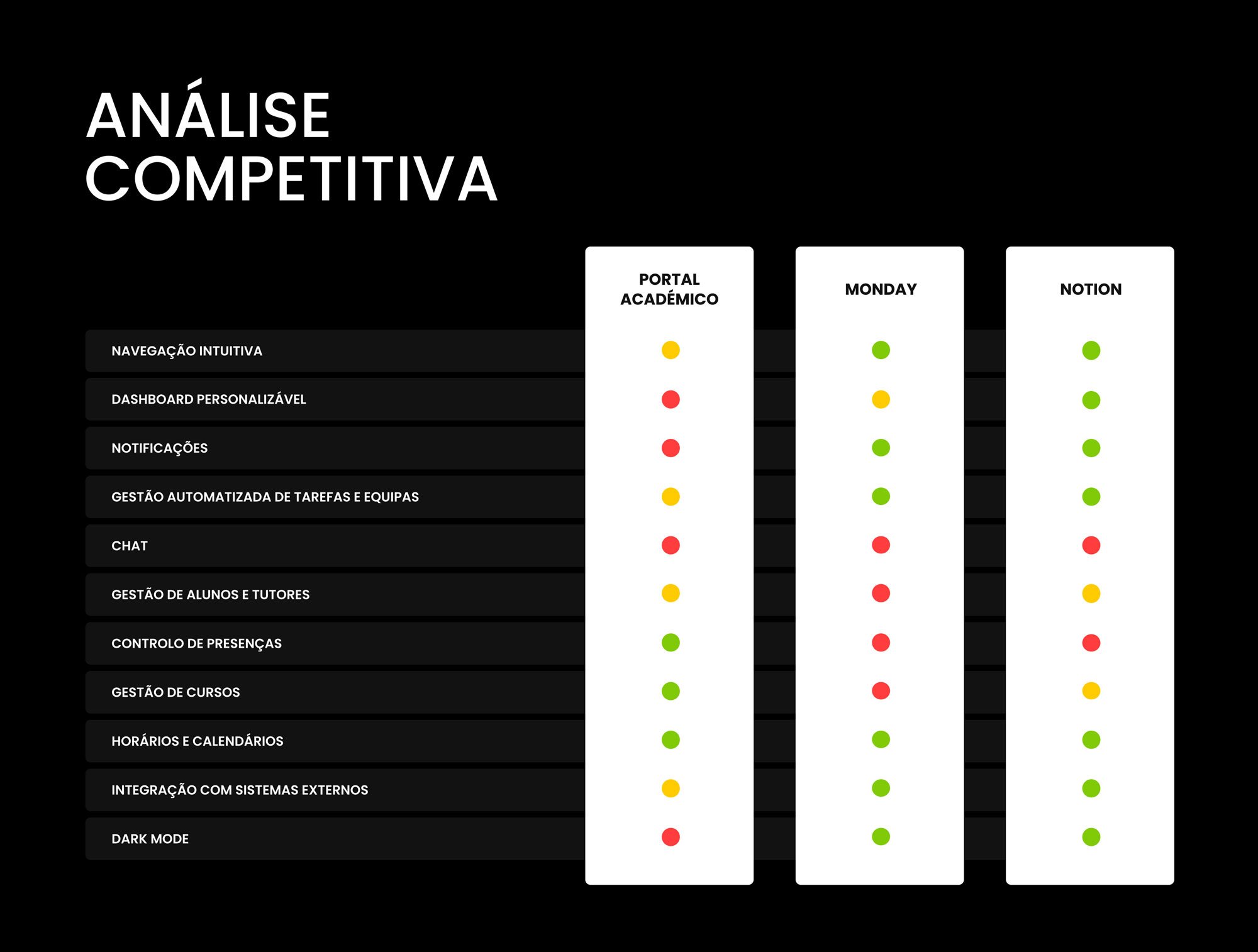
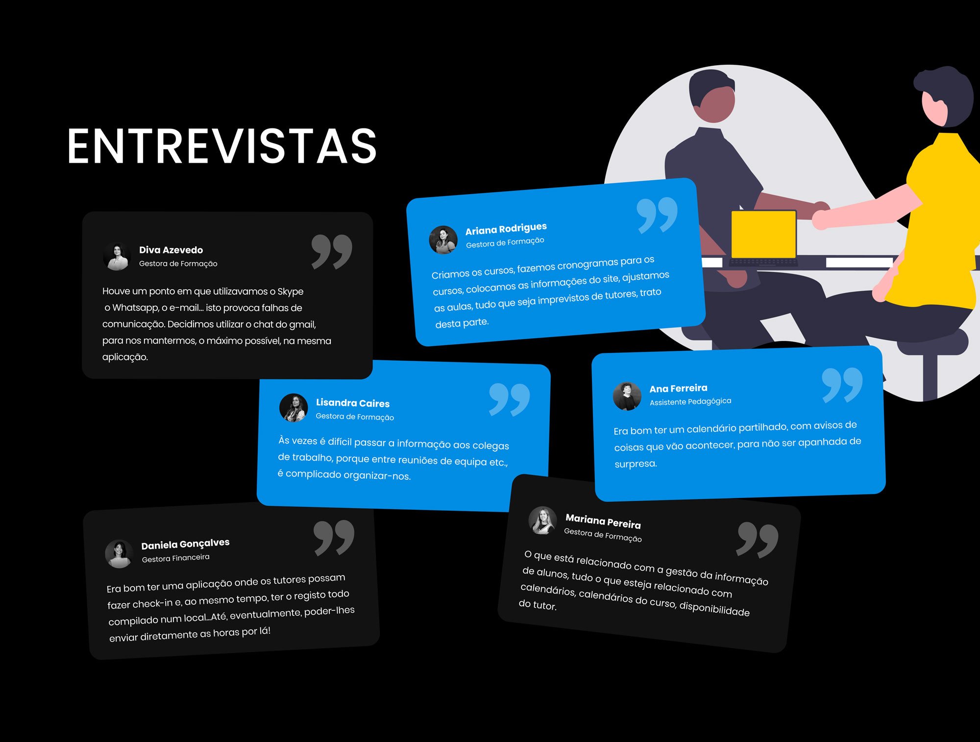
Competitive analysis against Monday and Notion, alongside interviews with the training managers who'd actually use this daily.
Six interviews with training managers, a pedagogical assistant and a finance manager surfaced the same complaint from different angles: switching between Skype, WhatsApp, email and Slack to reach the same people, and no shared calendar to catch schedule changes before they became a problem. That research converged into a persona, Matilde Freitas, 29, a training manager (Gestora de Formação) based in Porto, whose goals (automate the busywork, centralize communication) and frustrations (a recent team still figuring out its own processes, information scattered across too many tools) were mapped against a Says/Thinks/Does/Feels empathy map, and a current-state user journey walked through her actual worst-case scenario: a tutor cancelling a Friday class by WhatsApp on a Wednesday, and the scramble across Slack, WhatsApp, calls and email that followed.
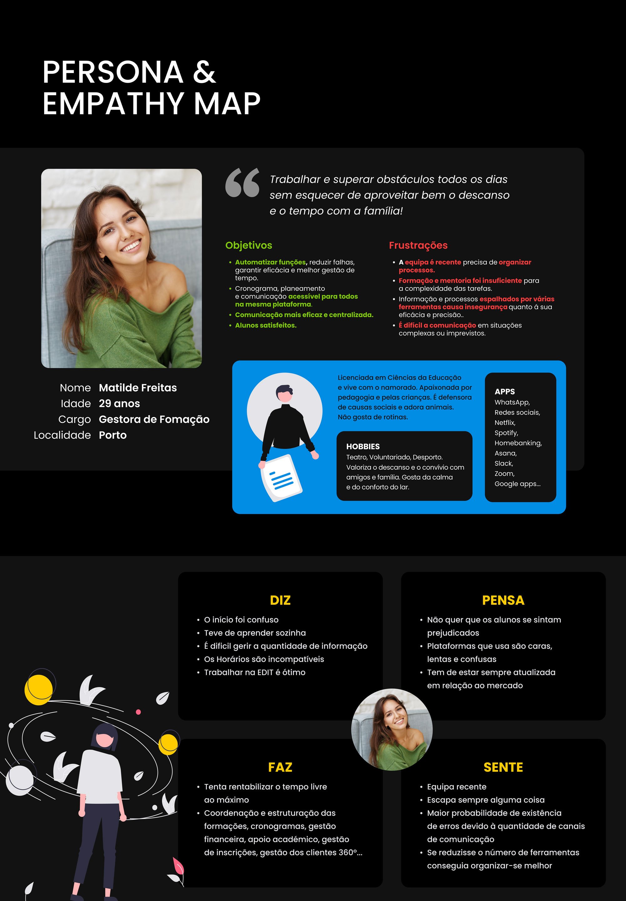
Persona: Matilde Freitas, 29, Gestora de Formação, Porto.
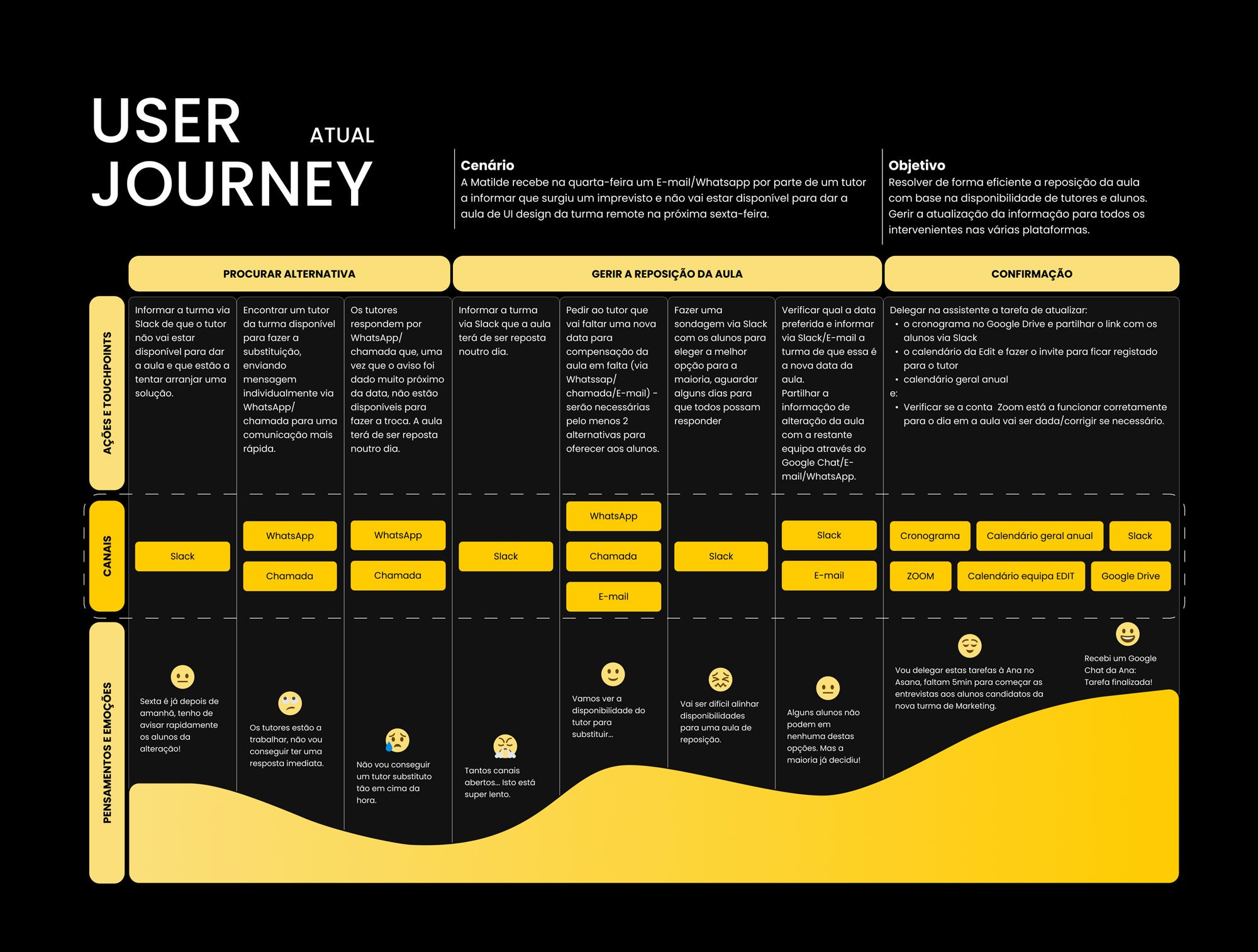
Current-state journey: a class cancellation, and every channel it takes to resolve one.
From insights to structure
A card-sorting exercise tested how the team itself expected the platform's own sections (profile, students, calendar, tutors, 360º clients, notifications, chat) to be grouped, and that structure became the site map: one dashboard hub branching into calendars, students, tutors, courses, clients, planning and profile, with check-in, notifications, surveys, search and chat as quick-access shortcuts from anywhere.
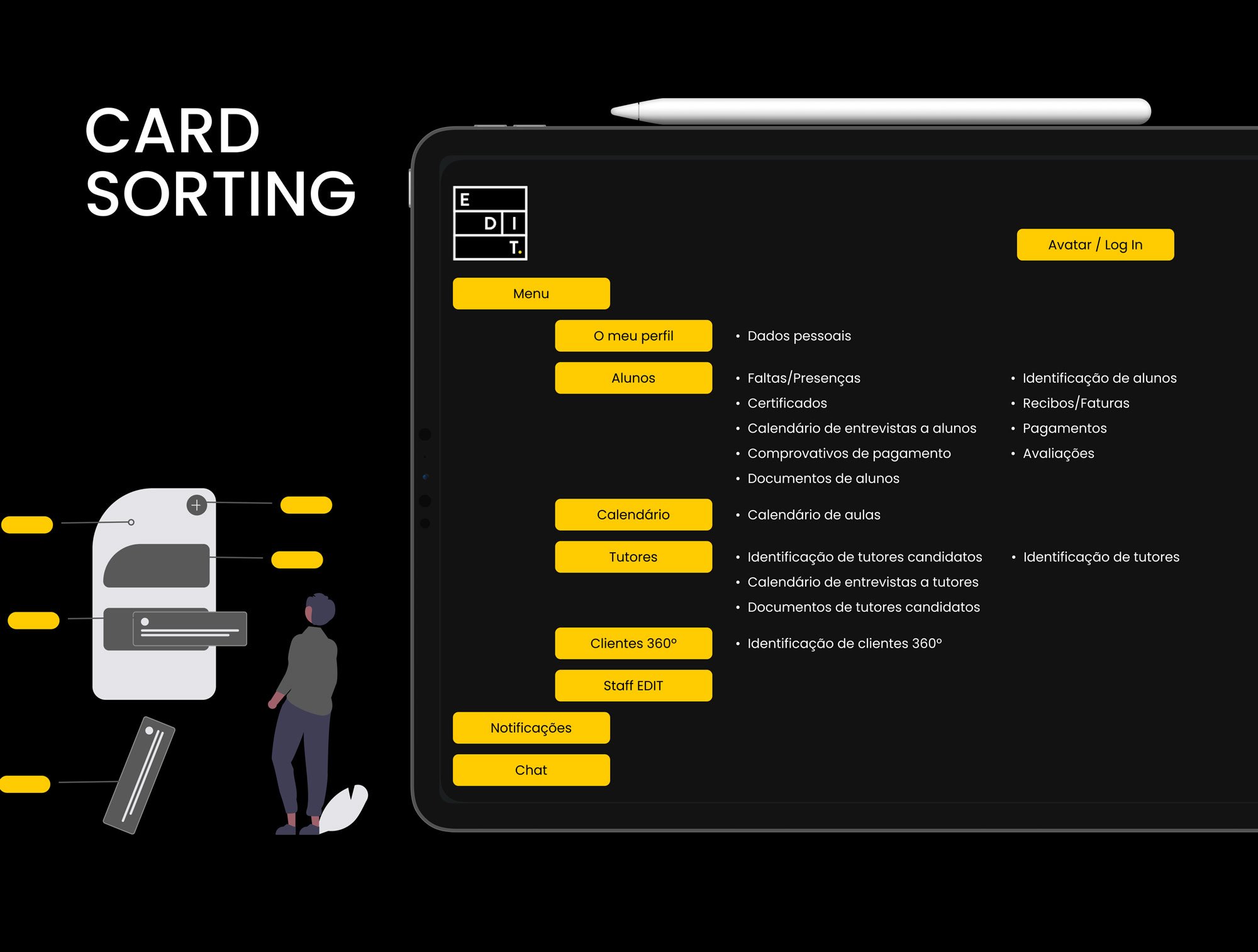
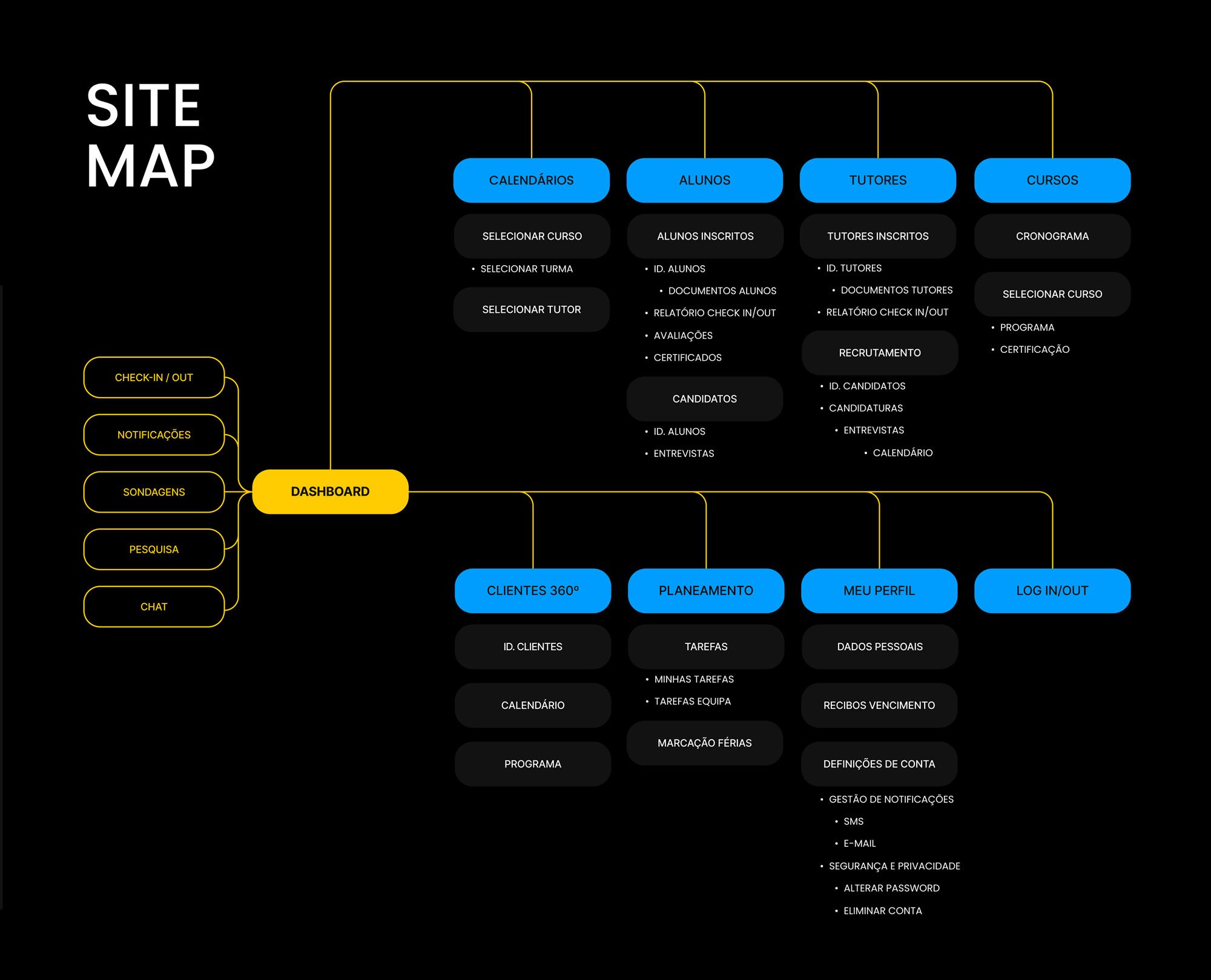
Card sorting → site map: the structure came from how the team itself grouped the pieces, not a guess.
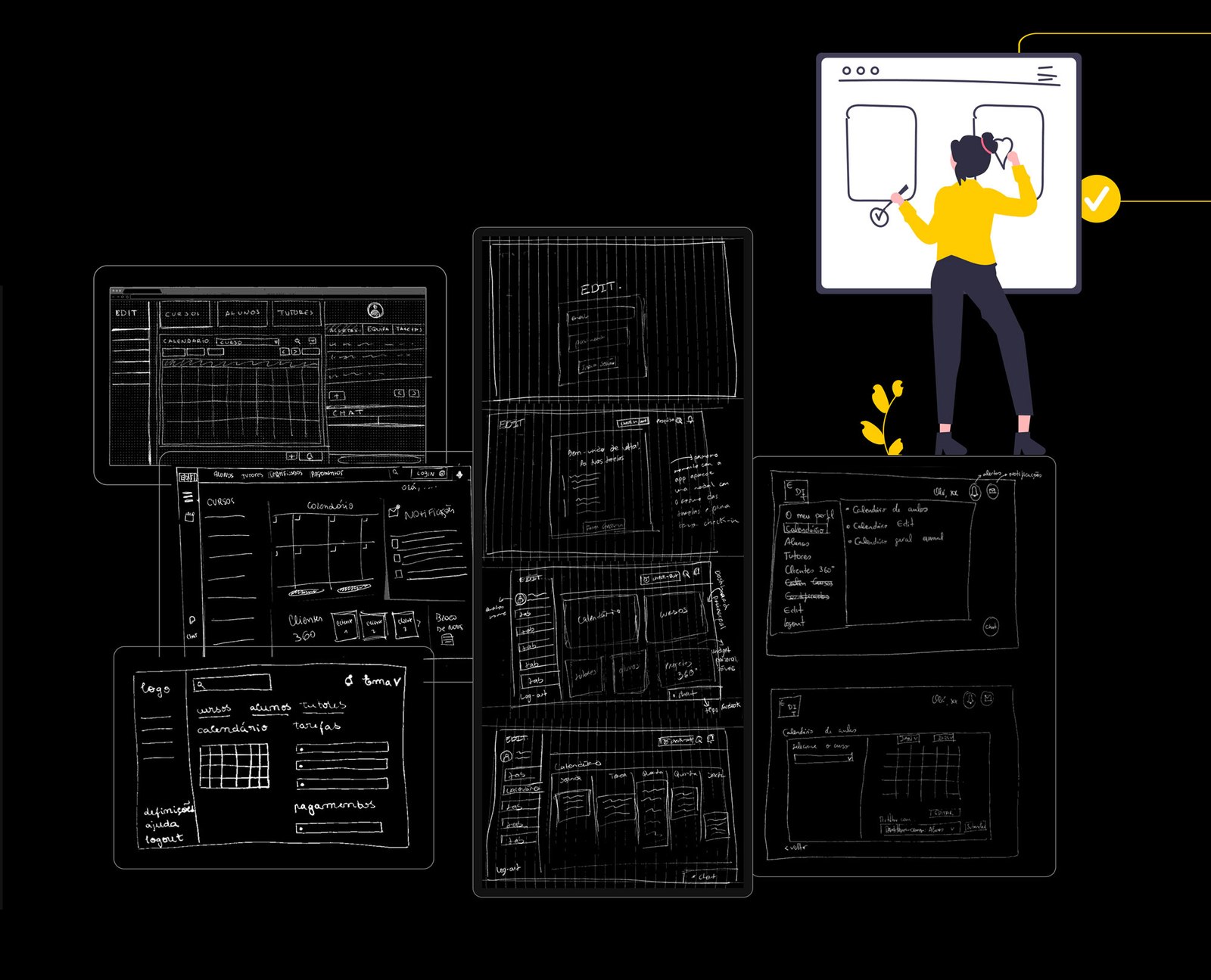
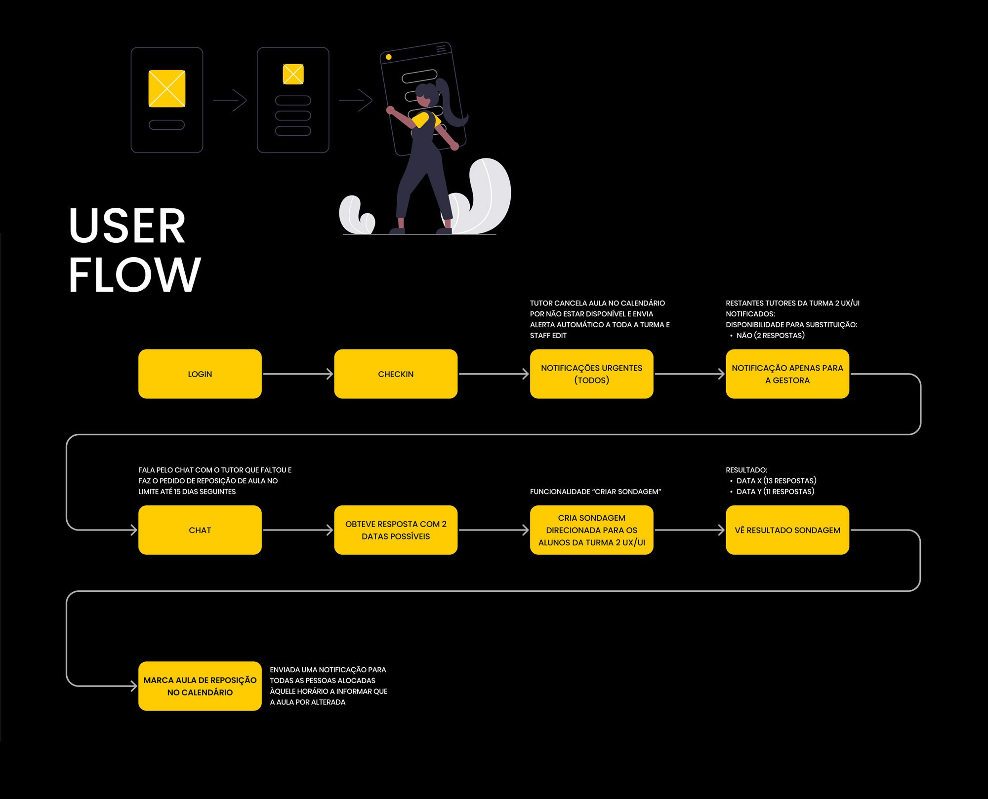
Paper sketches, then the user flow for resolving a cancelled class end to end: login → check-in → urgent notification → chat with the tutor → a poll to the affected students → the class rebooked automatically.
Checked back against a future-state version of Matilde's original journey, the new flow cut the same class-cancellation scenario down to two channels (the new platform plus Zoom, instead of Slack, WhatsApp, calls and email), a fixed 10-business-day resolution window instead of an open-ended scramble, and emotions that stayed positive the whole way through, down to Matilde's own closing note: "não preciso fazer mais nada."
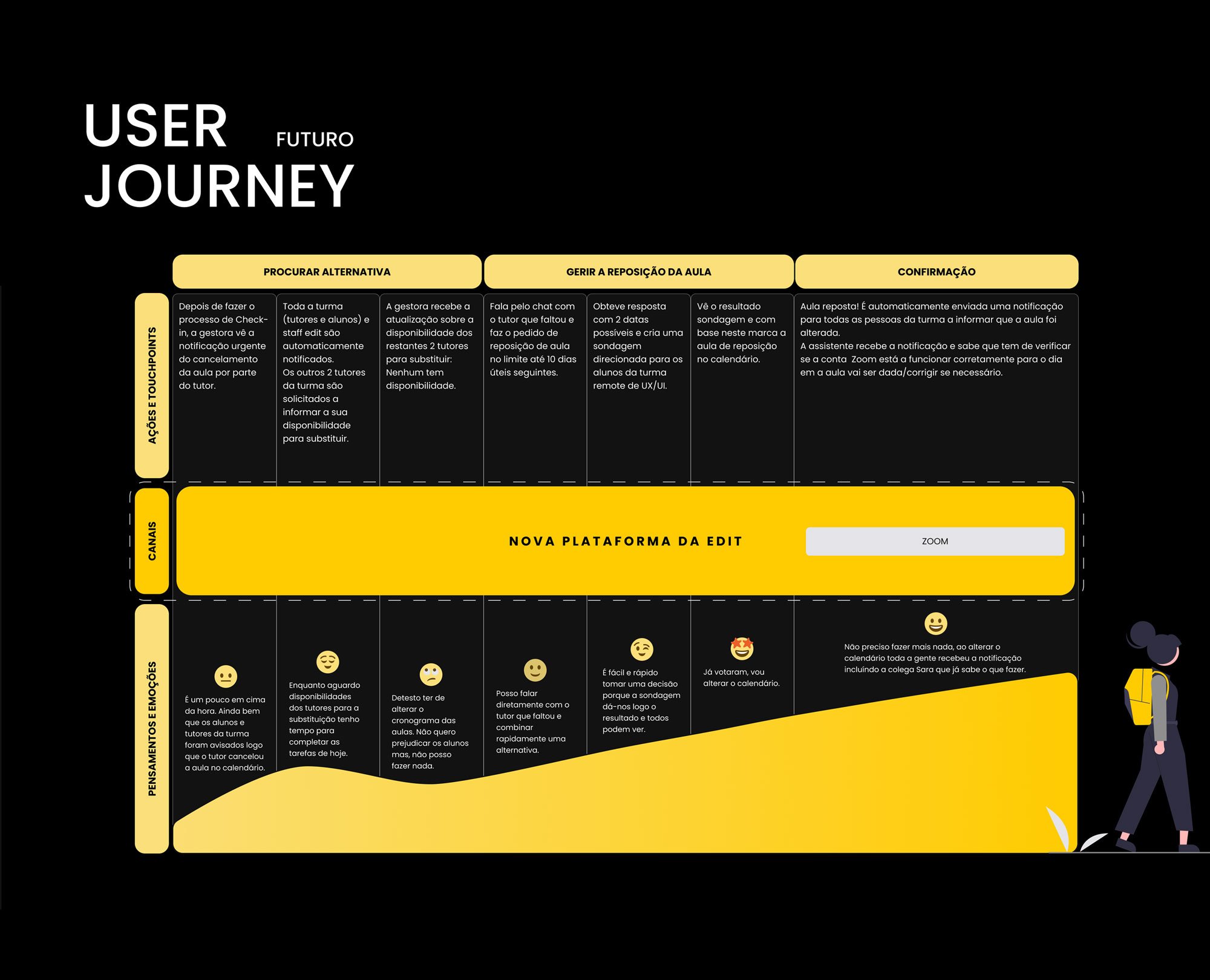
The same scenario, redesigned: two channels and a fixed resolution window instead of an open-ended scramble across four.
Benchmark & UI kit
A functional benchmark (dashboards, calendars, client-management and chat screens from other products) and a separate visual benchmark (colour, typography and imagery references, including an Urbanist-style display font and a bright accent palette) fed into a small UI kit: Poppins across three weights, a palette running from bright yellow through blue, green, red, teal and purple, a matching icon set, and core components (inputs, dropdowns, filters, login and check-in states) built on a 12-column grid before any final screen was drawn.
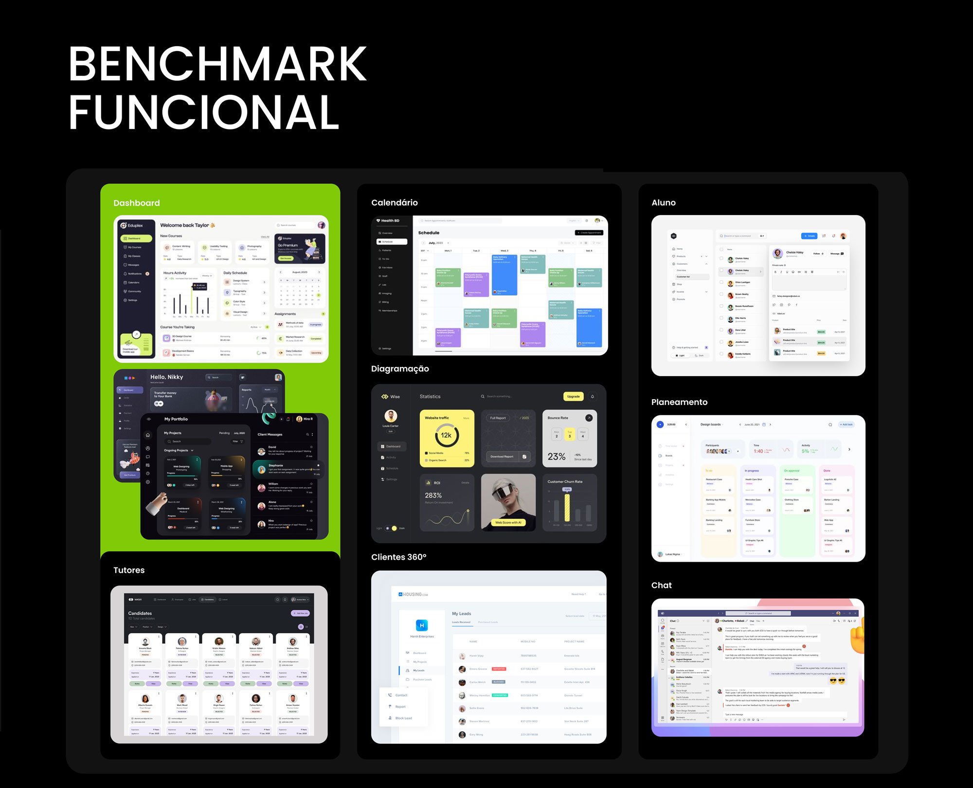
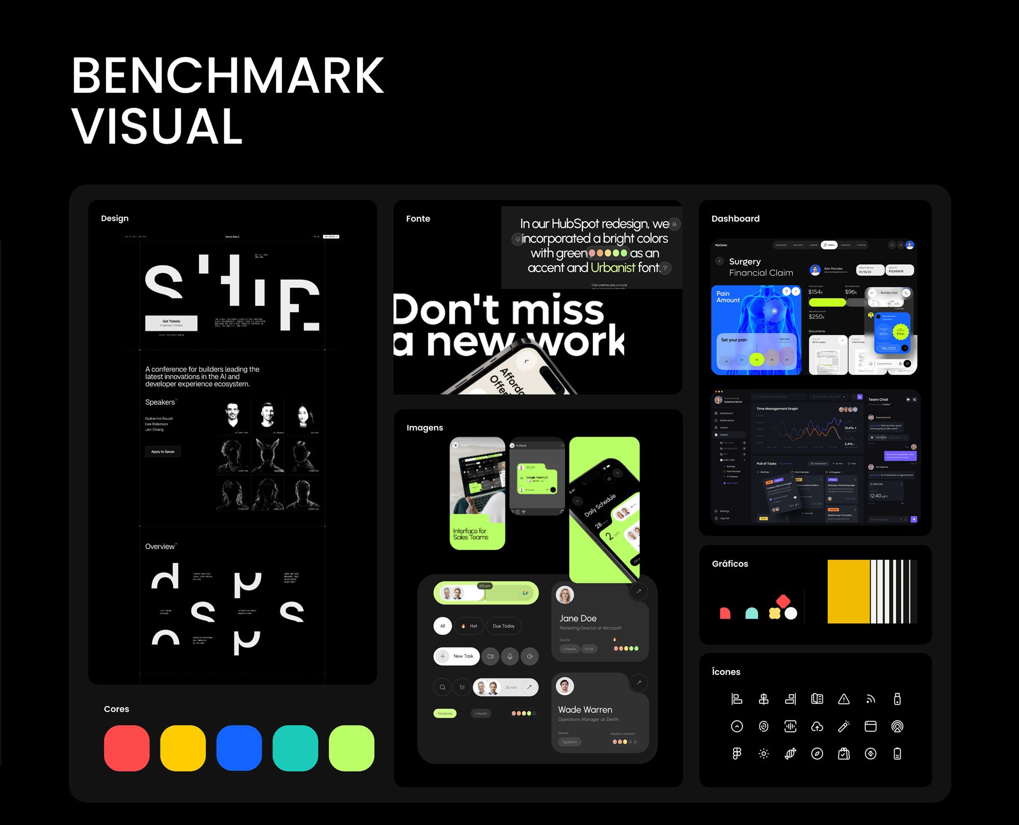
Functional and visual benchmarks: what other tools got right, and the palette and type direction to borrow from.
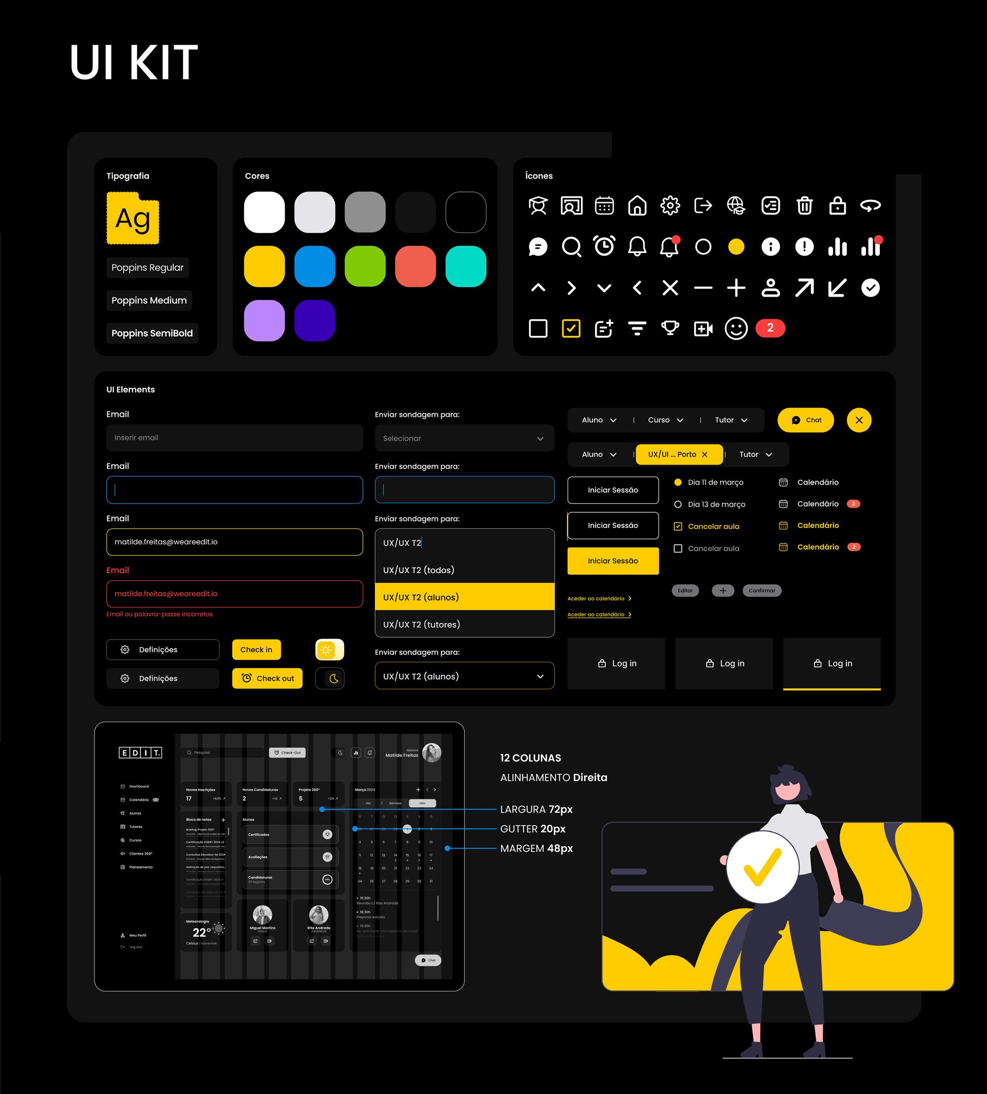
The UI kit: type, palette, icons and components settled before the final screens.
The final prototype
The prototype landed on "Future Proof Education" as the platform's front door, carried through into a full clickable walkthrough:
Full case study walkthrough: research, structuring, iteration and the final prototype, end to end.
Reflection
This project is where the research-first habit really stuck: building the card sort and persona before touching a site map meant the structure that followed was answering a question that had already been asked, not one being guessed at the wireframe stage.