
The brief
Mammoth is a data management company, and the ongoing brief has been to create communications that actually land with data experts and enthusiasts, an audience that's usually sceptical of marketing gloss and quick to tune out generic SaaS messaging. That work spans social media, presentations, an annual infographic recapping the year for users, lifecycle emails, and the marketing website itself.
Writing for people who already know the category
Communicating to data experts means the usual "explain the basics" playbook doesn't work, the audience already understands what data management is, so content needed to skip the 101-level explanation and go straight to specifics: real numbers in the year-in-review infographic, real product context in social content, rather than the abstracted, benefit-speak language that dominates a lot of B2B marketing. That same restraint carries through the two deliverables below.
Email lifecycle communications
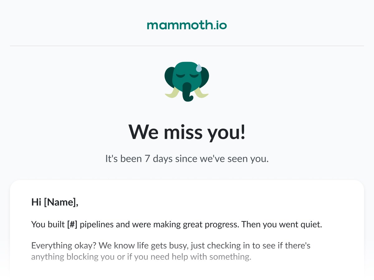
An ongoing set of lifecycle emails: onboarding nudges, trial reminders, feature announcements and re-engagement notes, all carrying the same no-nonsense voice as the rest of the brand. The year-end recap is the one piece built to be read in full rather than skimmed, so it's shown here at its actual length.
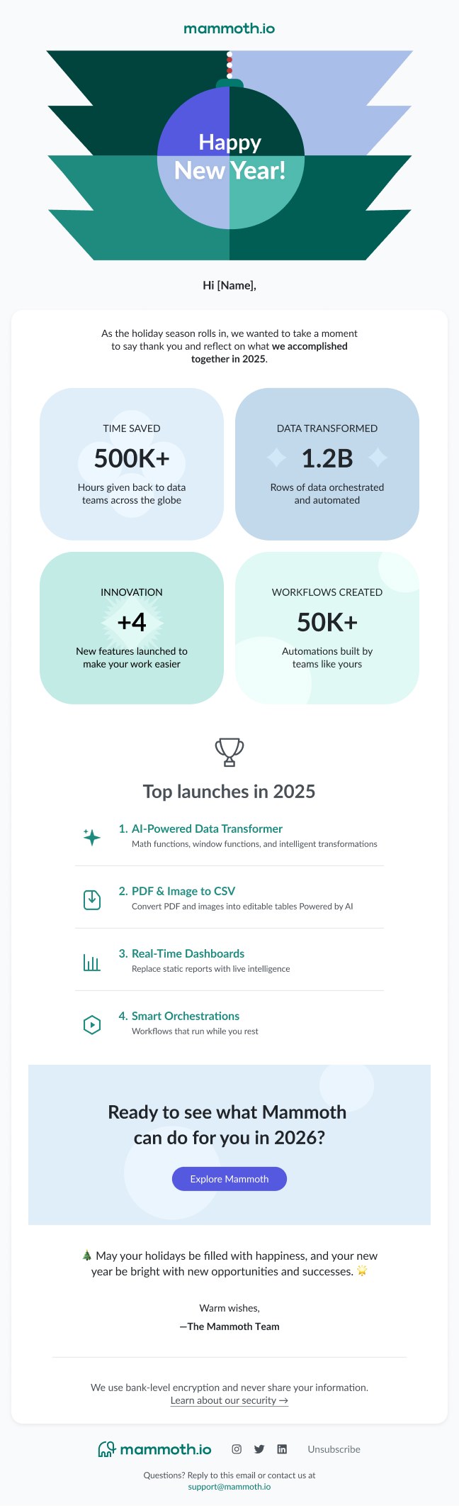
The year-end recap: the one email in the set meant to be read start to finish, not just skimmed for the button.
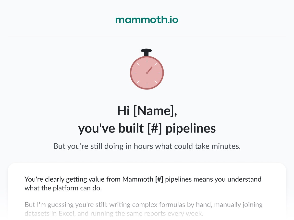
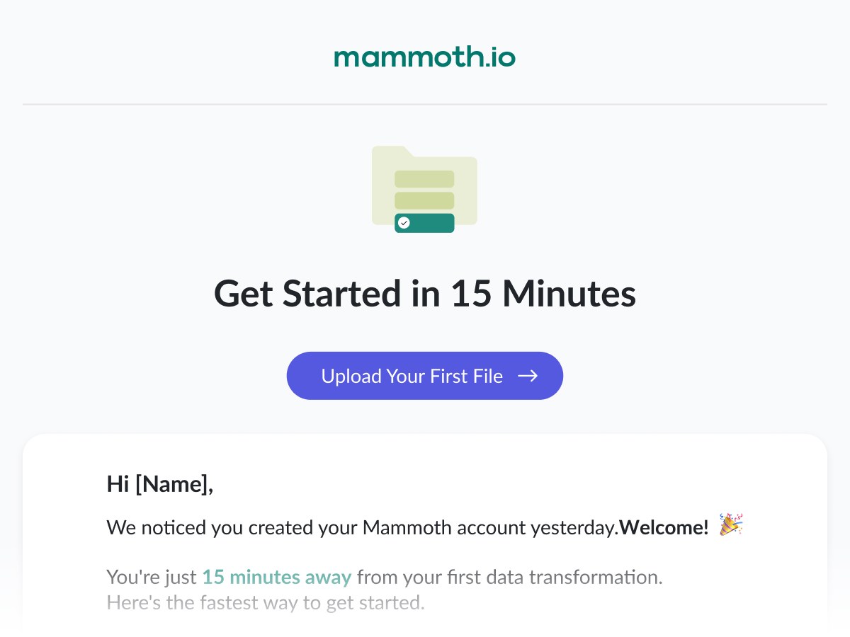
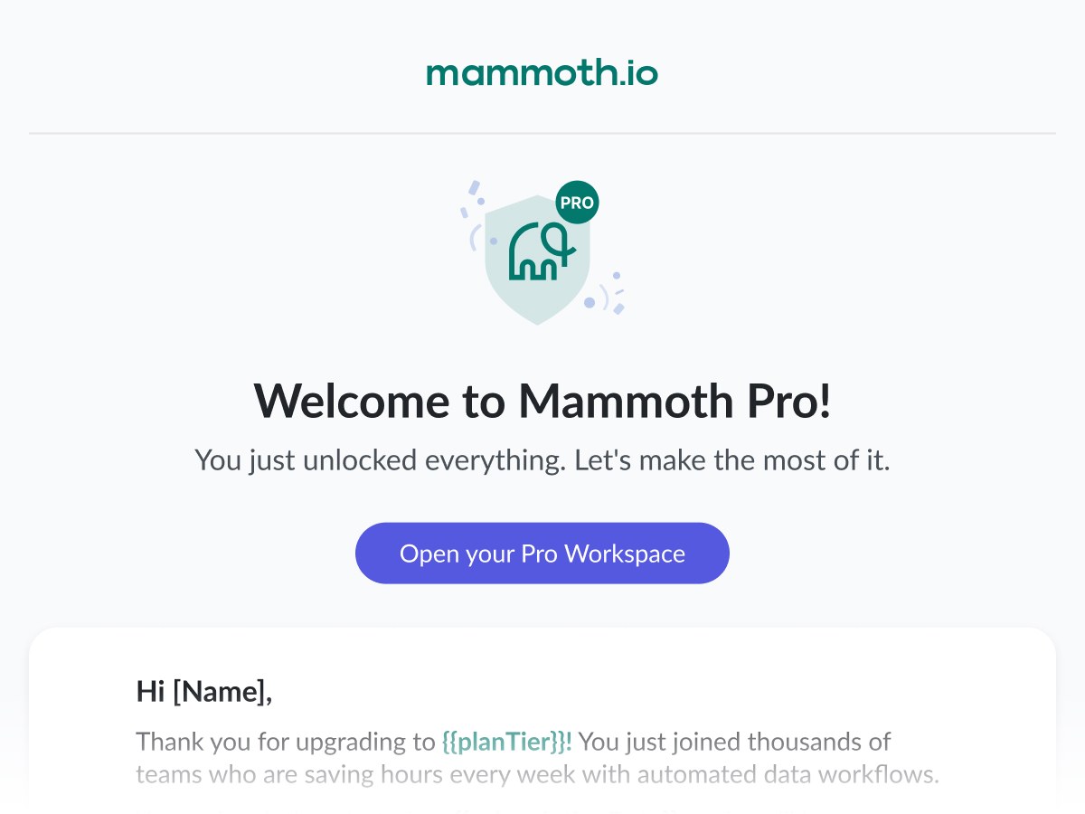
Eleven more from the same lifecycle, spanning onboarding, feature announcements, trial pressure and win-back, each opening the same way before the copy does its job further down:







The website: from feature grid to argument
The site went through more than one direction as the product and its story matured. The latest exploration moves away from a conventional features-grid homepage toward a single continuous argument: numbered chapters that walk a visitor from "your tools don't talk to each other" through connect, prepare, govern and share, ending on the dashboards that get shared for free. Same no-nonsense tone as the rest of the brand's communications, just built for scrolling instead of reading.
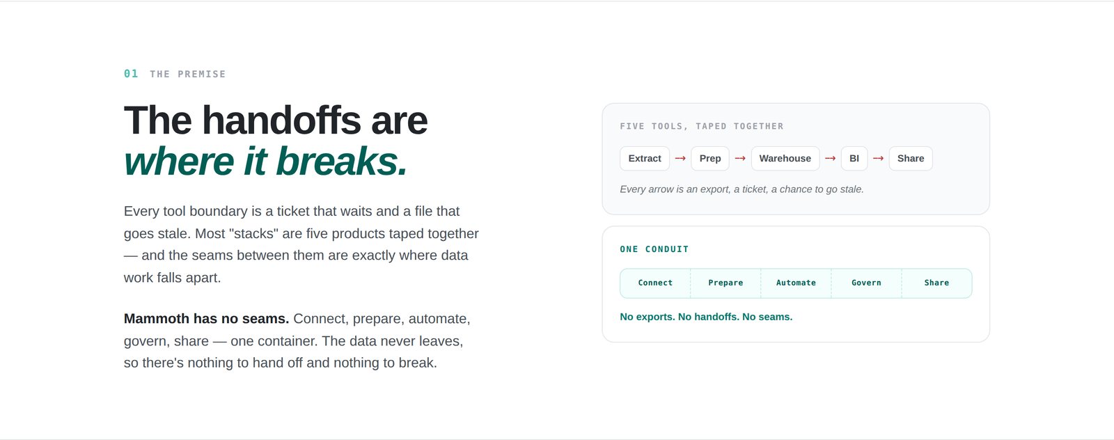
Chapter 1 sets up the problem before the product shows up: every handoff between tools is a place data work quietly falls apart.
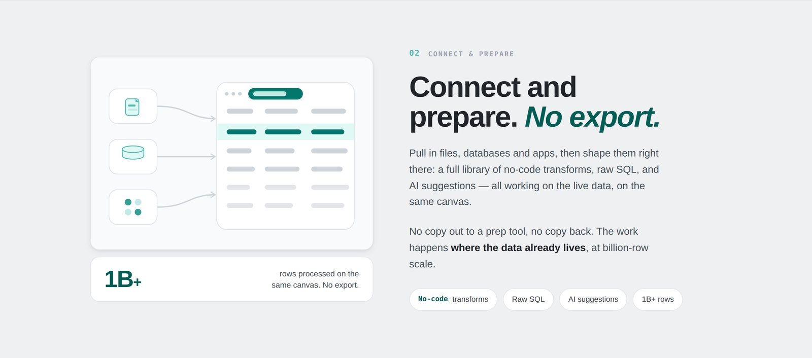
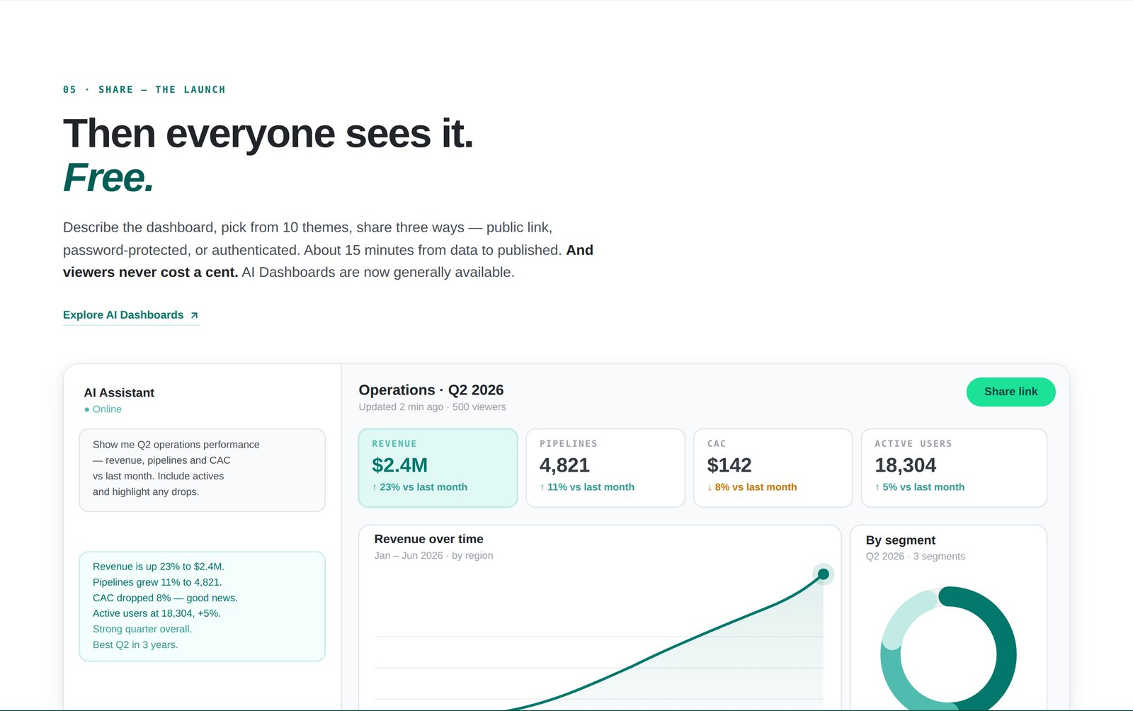
Two later chapters: the flat, no-export data canvas, and the dashboard that gets shared with the rest of the company for nothing.
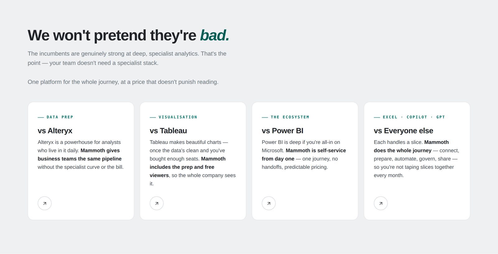
The closing argument: naming the incumbents directly instead of the usual vague "legacy tools" swipe, and saying plainly where Mammoth fits next to each one.