
The problem
Mammoth is a SaaS data management platform, dense, technical subject matter (dataflow pipelines, duplicate records, row counts in the billions). When I joined, the communication around it was quite simple: plain text decks and screenshots, functional but forgettable, and hard to sit through if data wasn't already your job.
The solution
A friendlier illustrated visual language, isometric icons, a consistent mint-and-dark-teal palette, and a recurring elephant mark, built to carry the weight the copy alone couldn't, and to make dense data concepts land in seconds. Applied consistently across social posts, client case studies, internal decks, and the annual year-in-review recap.
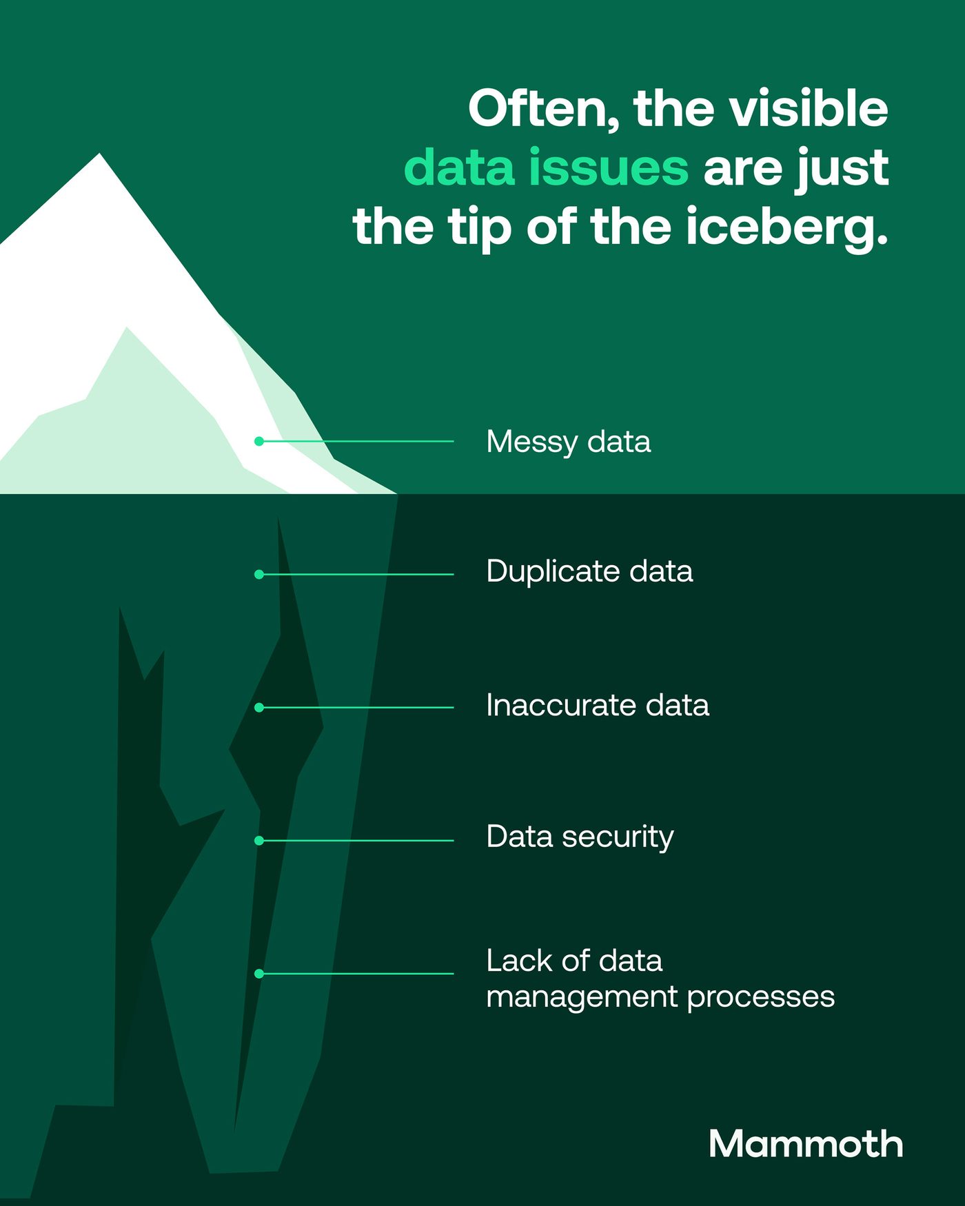

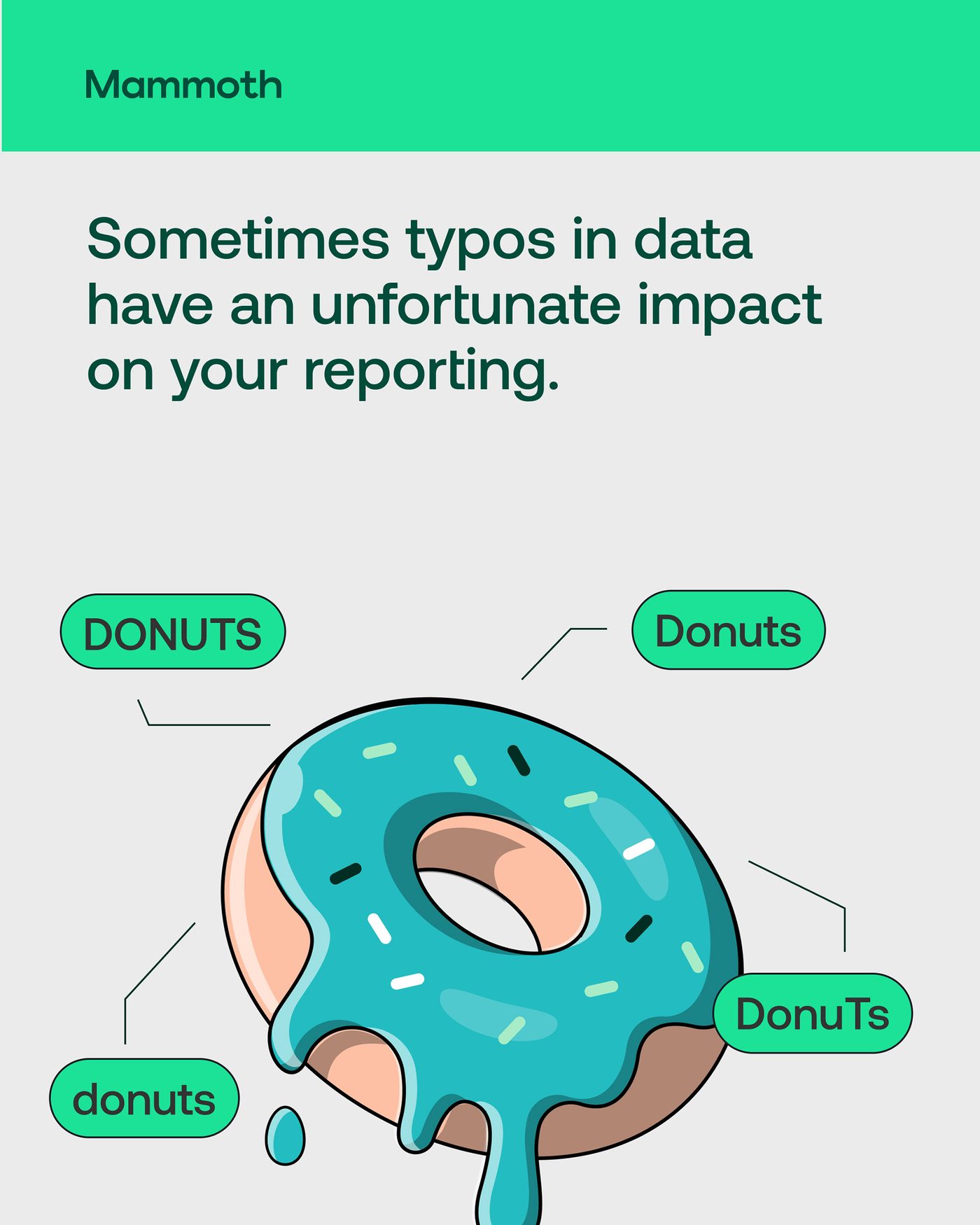
Part of the social media strategy: one visual metaphor per post, built to make a dense data concept land in the time it takes to scroll past it.
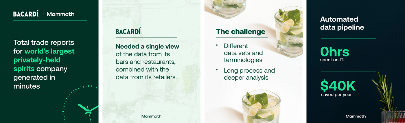
Client case study material (Bacardi), same visual system throughout.
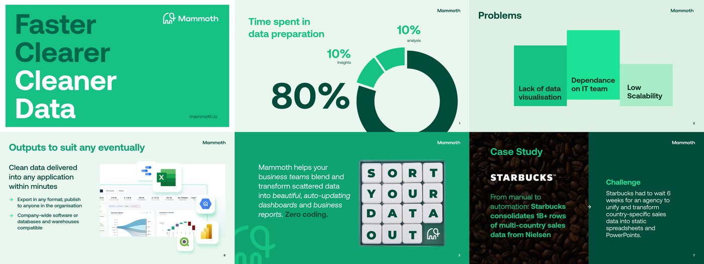
Reusable slide formats, so new decks stayed on-system.

Part of the icon set built for social content.
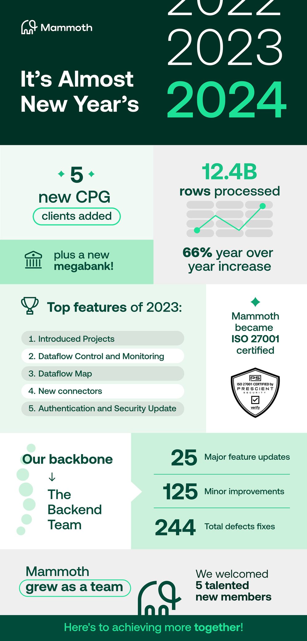
The annual year-in-review recap, sent to the whole user base.